G is for Guidelines
If you want to build a brand then you need to make sure you’re using the same look and feel every time you communicate. This builds up recognition and helps people to find you.
The easiest way to ensure it’s the same each time (unless you’ve got a brilliant memory) is to write it all down in one place. This is essentially all brand guidelines are.
What to include
People often ask us what they should include, but they’re as individual as your brand is. Your guidelines should be a living document that changes as you develop the brand. Make sure it’s useful and not too restrictive. You need to establish the framework while giving your designers room to be creative!
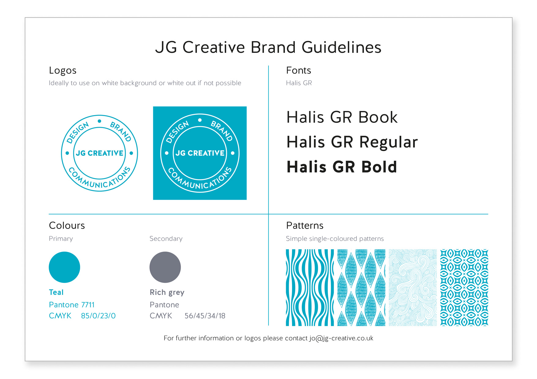
Often they can be as simple as one page which has just the essentials – logo variations, colours and fonts. This is an example of ours:
If you have a more complex brand then you might want to give more information about the following elements:
Logo
Include information on;
- How to use it (exclusion zone / minimum size with and without strapline / variations etc)
- Colour versions (black version, reversed out version to use over a solid colour or image etc)
- How it appears with other logos – positioning and hierarchy
- Positioning – keep it in the same place and at the same size when on a letterhead, a poster, A4 etc.
Colours
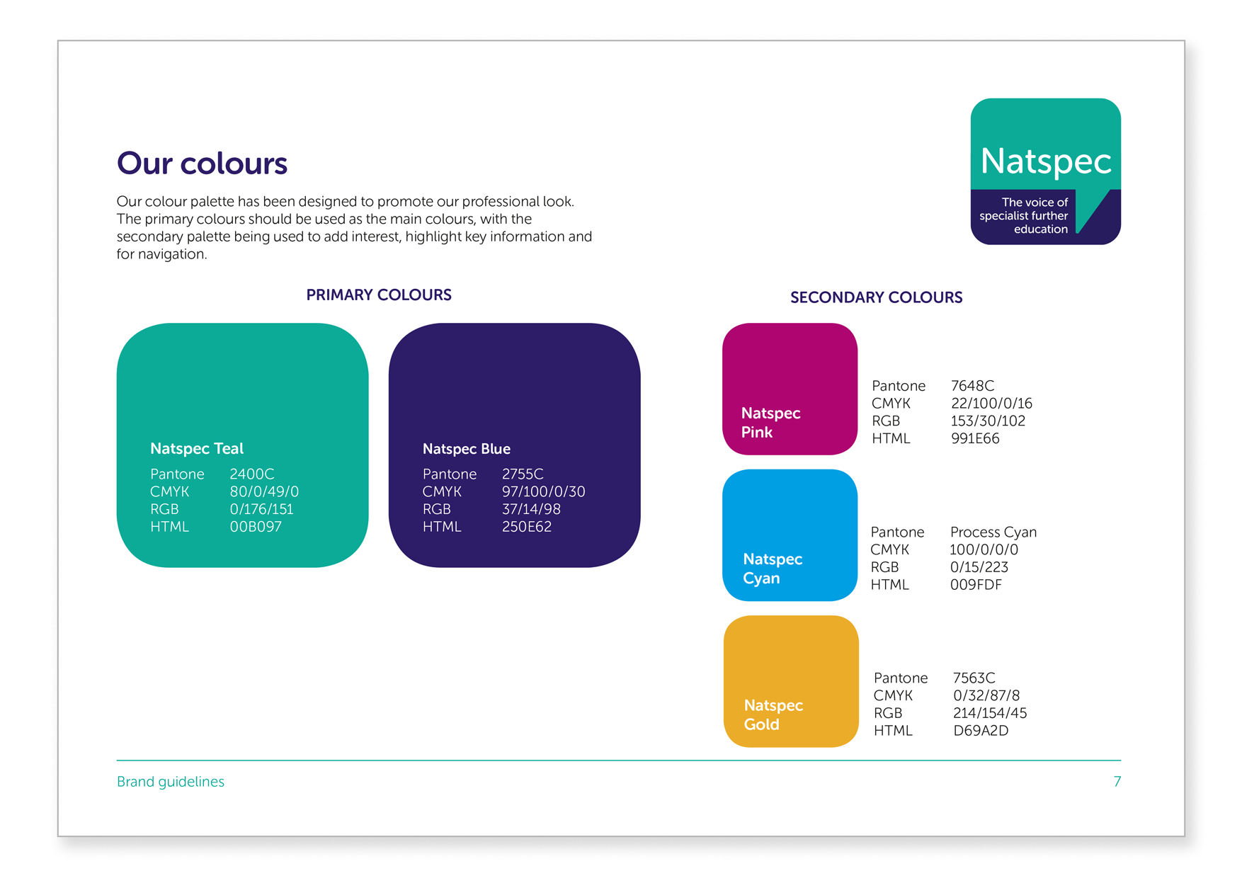
They often have pages which show your brand colours – it’s helpful if these include the Pantone reference, a CMYK breakdown (to use when it’s printed), and RGB breakdown (for use on screen) and a hex reference (to use online). Don’t worry if you don’t understand any of those terms, your designer will! Here’s an example we created for Natspec.
Fonts
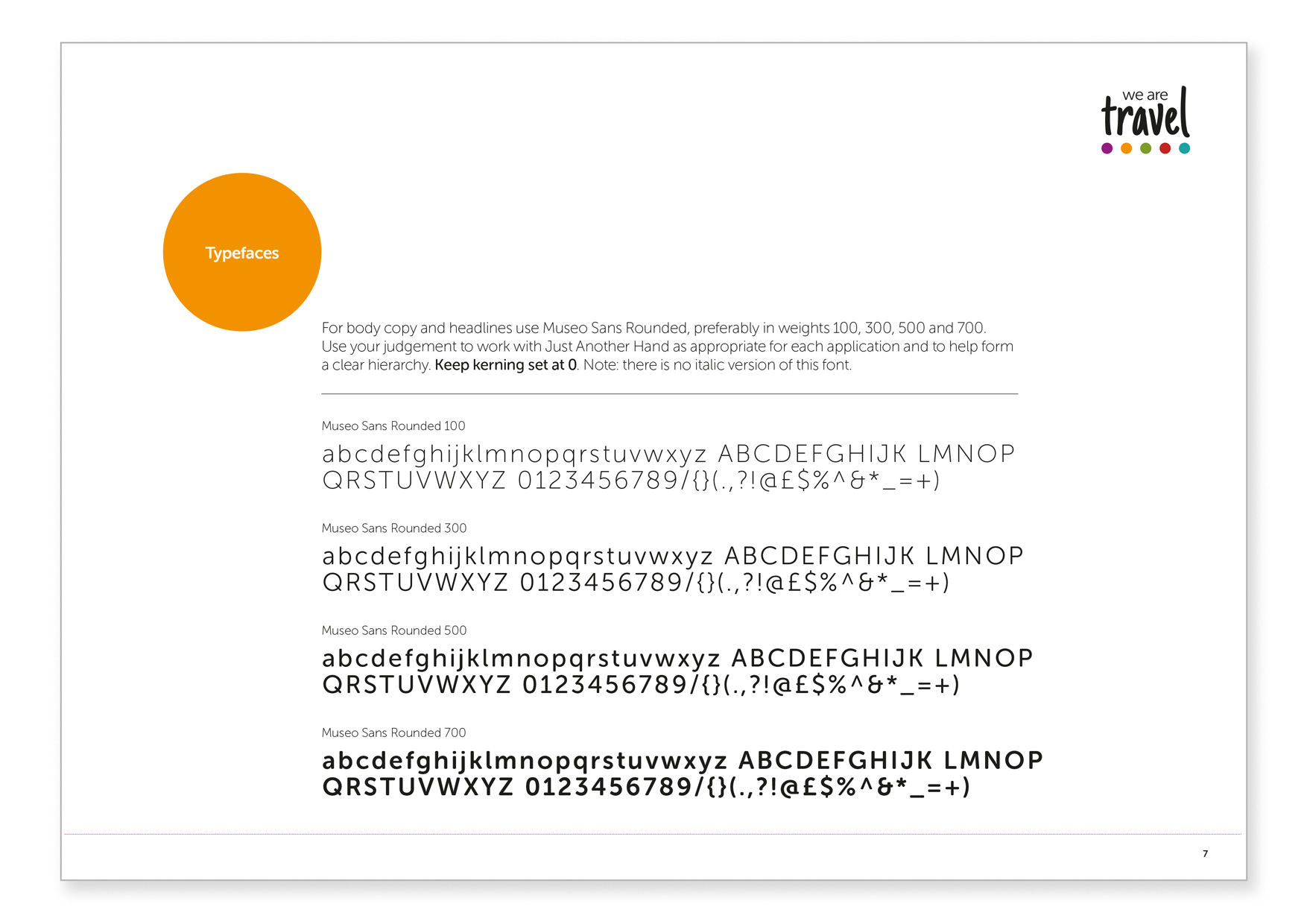
You’ll want to specify the fonts that you use. Include all fonts in your brand with variations (bold, italic etc) and how to use them. For example one might be just for headlines and one for body copy. You might need to specify a different one for your website or for staff to use on their PC. Remember everyone using a font needs to have a license for it so don’t set rules that will be expensive to implement! A good examples of this is in the guidelines we did for we are travel:
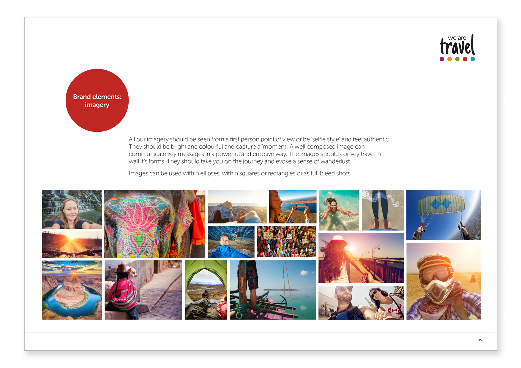
Images
You should also include your image style, especially if your brand is photography-led.
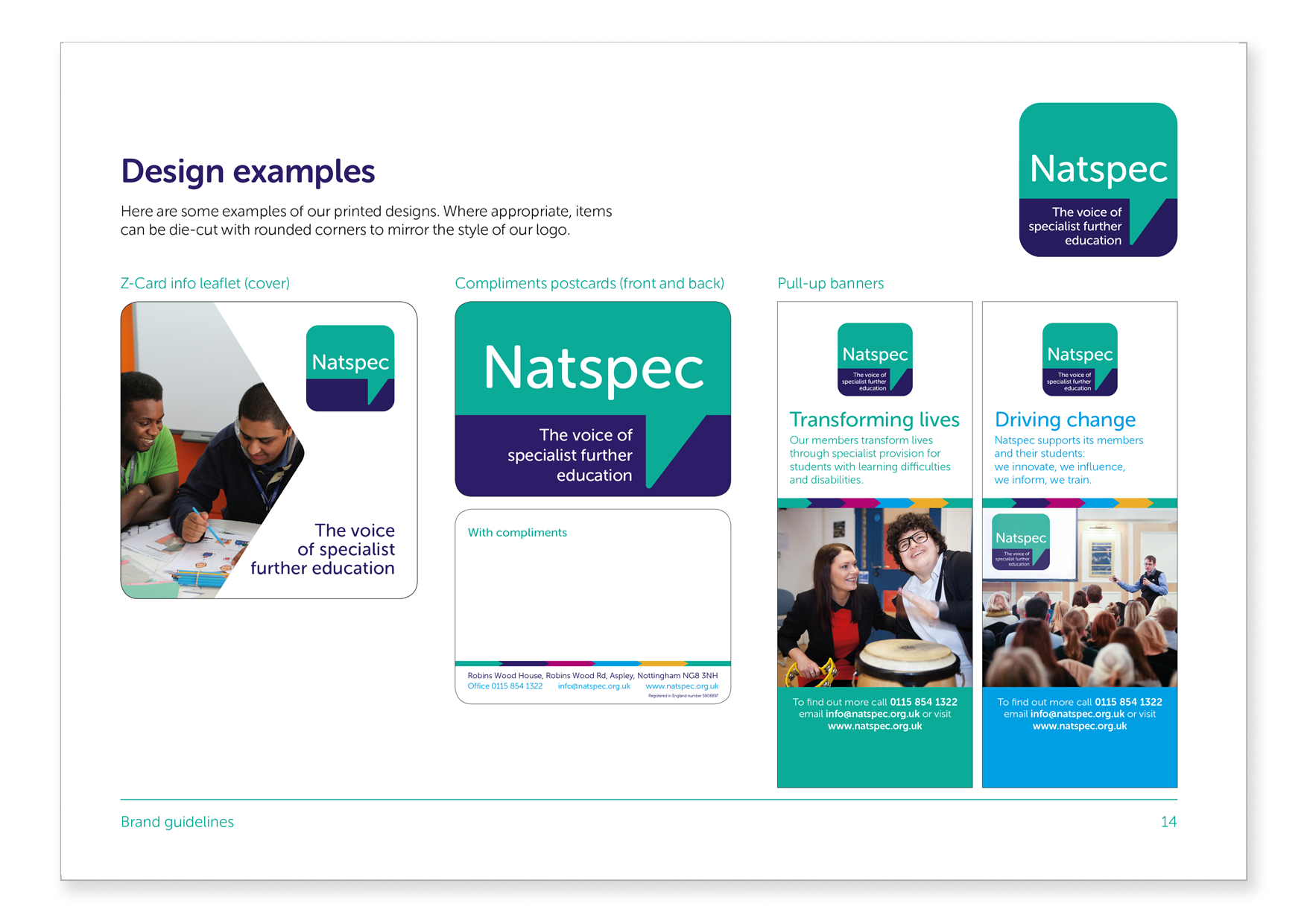
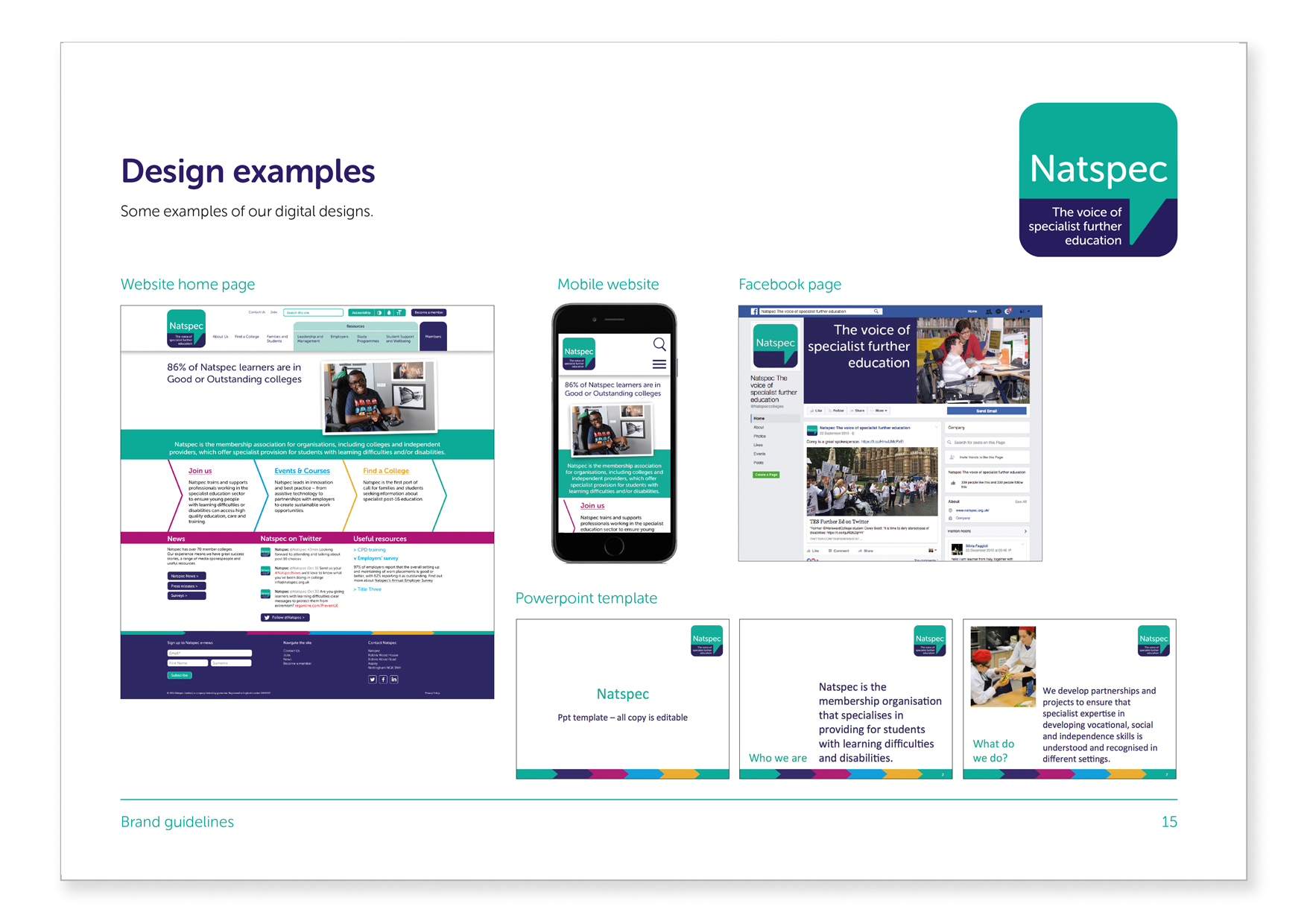
Brand in action
Finally, include examples of existing materials which show a wide range of different formats including large items like signage or pull up banners, small printed formats like leaflets, online examples like your website or social media and even clothing, promotional items and video if you produce themregularly.
 Tone of voice
More comprehensive brand guidelines include your verbal brand too, these are often called tone of voice guidelines. Your brand isn’t just what you look like it’s also what you say and how you say it. If you have a consistent way that everyone can use to describe who you are and what your key products and services are then it really helps to build understanding in your audience which should lead to them choosing you over competitors.
Here’s a handy checklist of everything that can be in your guidelines. Choose what you need to include so that your brand is communicating exactly who you are every time.
Check list
- Who we are / our brand values – an overview of the message you want to communicate
- Logo
- Colours
- Fonts
- Images
- Brand elements
- Tone of voice guidelines
- Key messages
- Examples of the brand in action
- What not to do – you might add this page to your guidelines later if your finding that there are common brand mistakes that people are making
- Contact details –make it clear who to contact with questions and what your approval process is for sign off.
This is just a broad overview, they can get WAY more detailed if necessary! We’ve done lots of these so if you want to establish some guidelines for your current brand or want to evolve or create a new brand we can help. Give me a ring on 01270 626624 or email jo@jg-creative.co.uk
 Jo Grubb
Owner and Creative Director