We did a full Marketing Audit and Brand Review for Cheshire Centre for Independent Living in Jan 2019. That helped them to see what changes to the brand they needed to make in order to communicate more clearly what they do.
We were thrilled to win the work after a pitch process and began with researching their audiences to see how they were perceived and what misconceptions were to the current name and messaging. We had a great response that gave us some really useful insight.
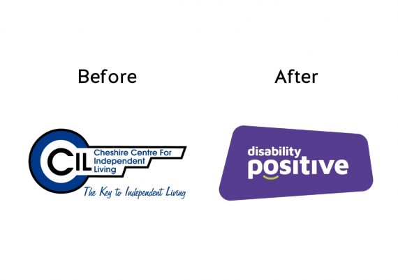
After brainstorming lots of potential new names (including checking there were no other charities using the name and that the URL was available) CCIL decided to make the decision to change to Disability Positive. As well as a name it worked as a description of their attitude too and the change they want to see in the world.
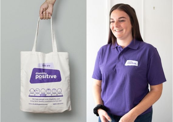
Then we got into the design process, creating a new brand for them which is strong and unapologetic. The irregular shape is a deliberate choice to highlight that society doesn’t neatly fit into one ‘ideal’. The emphasis of the words is on positive, with the contrasting green smile to further highlight the supportive nature of the organisation. The purple is a clean and vibrant version of the colour which is heavily used to represent the disability sector.
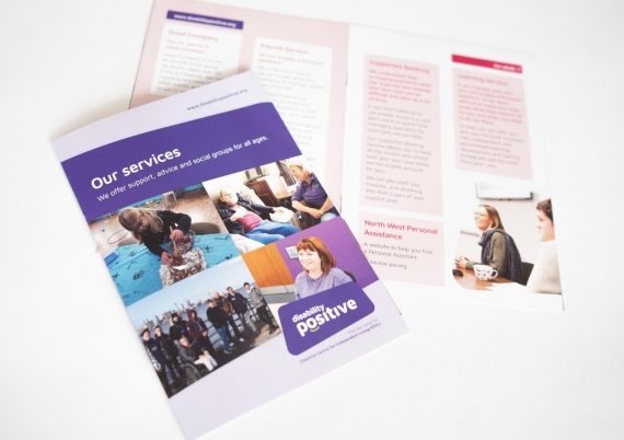
Doing a photoshoot with them (pre-lockdown) was a great way to ensure that everyone shown within the Disability Positive materials is a member of staff or someone who uses their services. We wanted to show them off!
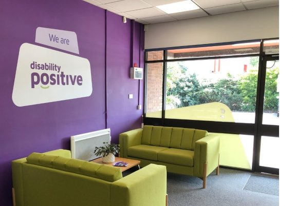
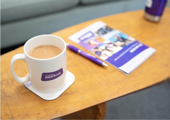
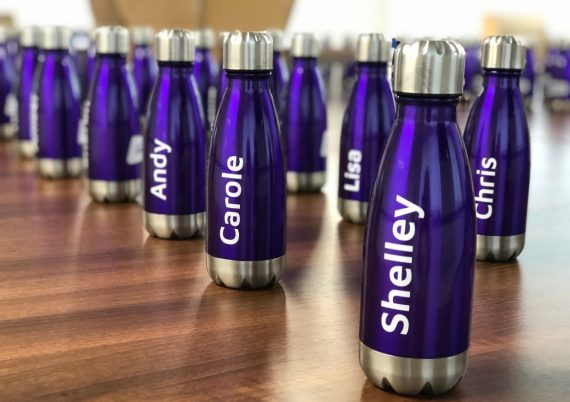
The staff were involved the whole way, and despite not being back in the office yet everyone came in (over a few days) to see the newly branded offices and get a bag of branded items to help them to promote the organisation and save the planet – through personalised bottles so the plastic cups can be removed!
Lynne Turnbull, Chief Executive of Disability Positive, said: “This a very exciting time for us and we are really proud of our exciting new brand. We have been introducing it at our head office over the last few days and getting lots of positive feedback.”
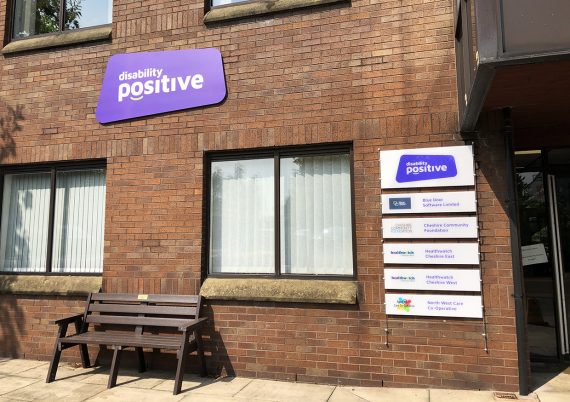
We also developed a fresh narrative and key messages, launched a brand-new website, rebranded the headquarters and revamped its social media channels and printed materials.

