We’re not talking about the pecking order in the aristocratic ranks here. We’re talking about visual hierarchy – creating order and structure in your communications to ensure the information is delivered in a way your audience will clearly understand.
How this is done will vary from piece to piece, but there are some basic principles we as designers follow.
1. Order
You wouldn’t expect to see a contents page halfway through a book, or some really important information set in the smallest type size on the page. Identifying the areas which have a ‘fixed’ place – contents at the start, index at the end, then deciding on the order in between is the first point in establishing a clear hierarchy.
2. Size
People are naturally conditioned to notice something which is larger than the other elements around it. The simple action of enlarging an image or some type, for example, will help to ensure that this is seen before everything else. Here is an example:
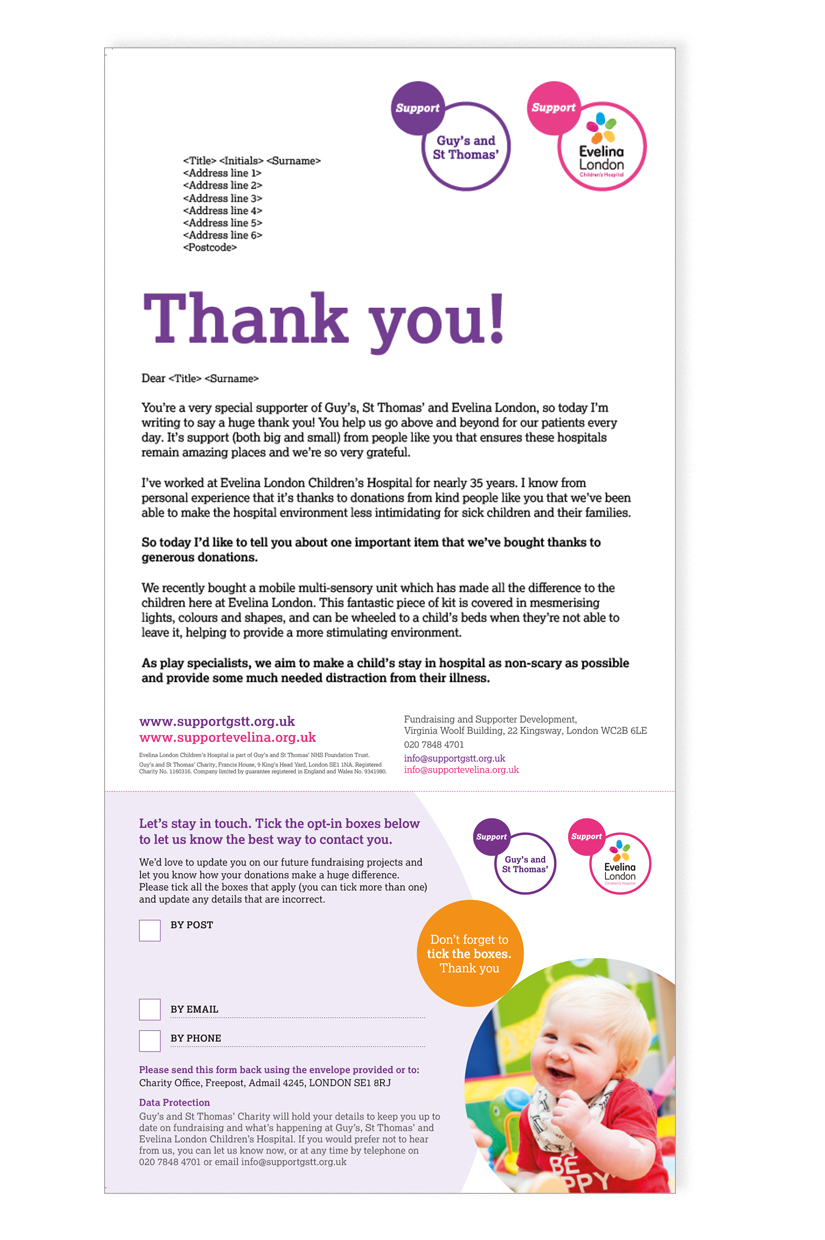
3. Colour
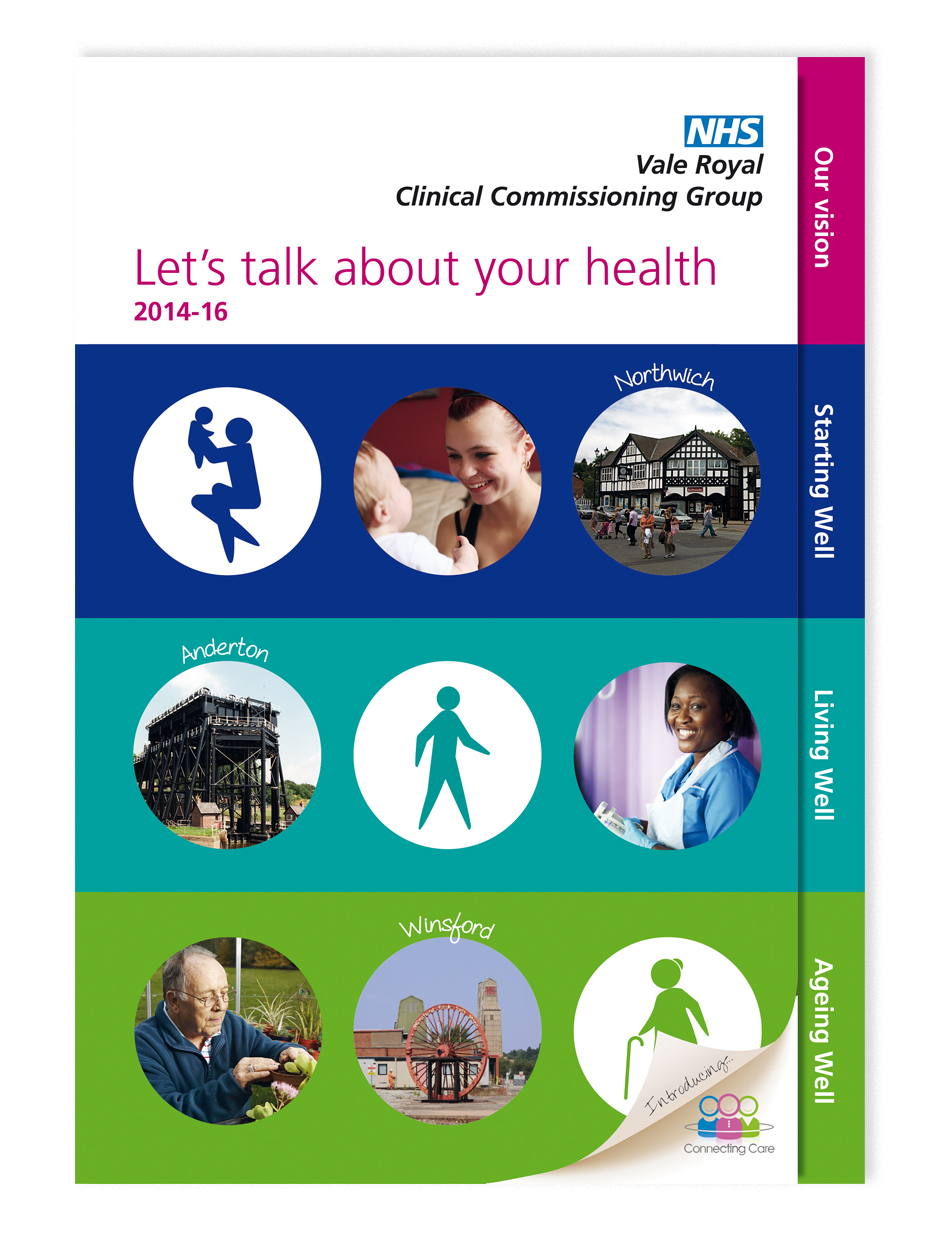
Colour plays a very important role in hierarchy. There are colours which complement and colours which contrast one another. All can be used to guide your eye through information. The example below is simple, but good. After the title ‘Let’s talk about your health’ the information is all of a similar importance, and the use of coloured bands helps divide the page and information into clear sections whilst keeping the information on the same hierarchical level. The pink contrasting colour for the heading is used to help this one piece of information really stand out on the page and leads people to the first tab to go inside.
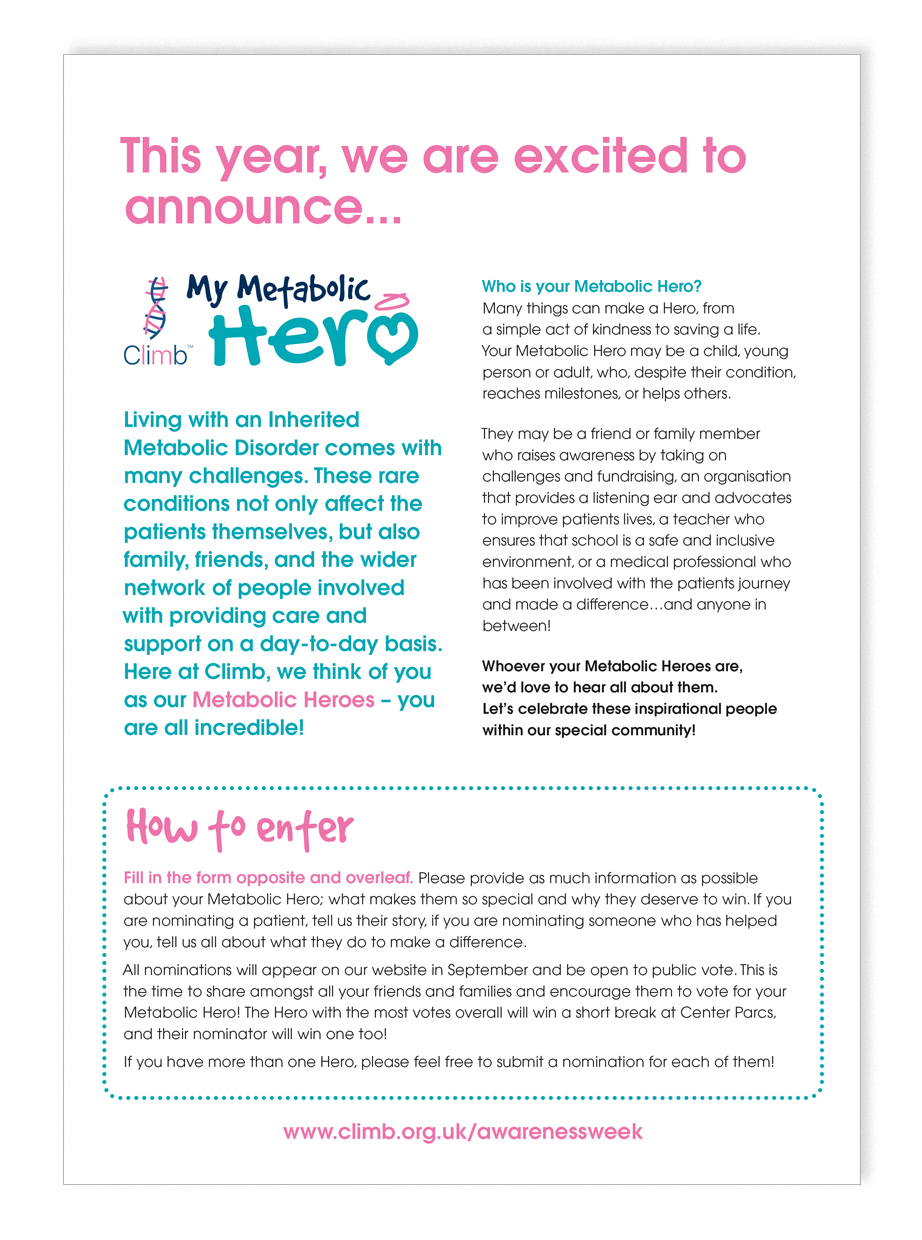
4. Typography
Type should take on the following structure: Heading, sub-head and body copy. This is most common in newspapers and magazine layouts where there is a lot of content to be read. The example here shows this in action. You will see even though some of the type is lower down in position on the page, its size dictates when you read it. It can also be used to give you options on how much information is read. Combining pull quotes, large intro paragraphs and smaller type size allows readers to just scan the key information, or read it in more detail.
5. White space
Cramming lots of information together on a page will result in a jumble of information which is confusing to navigate and will likely result in you not seeing anything at all. Don’t be afraid of clear space – it allows for flow and clarity. Glossy editorial magazine articles use clear space really well, but it can be used in any good design as demonstrated here;
Hierarchy is a complex and interesting design technique and we have only really scratched the surface in this blog. If you want to learn more or would like to discuss your requirements with us, give us a call on 01270 626624 or email jo@jg-creative.co.uk.
 Nicki, Senior Designer