I is for Infographics
They’ve been around for a while now but they’re still by far the best way to communicate data in an interesting and visual way. It’s a step up from a pie chart for sure, and the best ones tell a story.
The very best can be found here at information is beautiful‘s website. We have all their books in our studio and we can often be found drooling over them studying them.
But what are they? If you break the word down it’s simply an ‘info’ (information) ‘graphic’ (picture). Technically it’s a form of data visualisation but it all means the same thing really. It is about making dry data more visual and easier to understand at a glance. I don’t know about you but I’d much rather look at a picture than try and figure out what’s happening in a table of figures.
But let’s have a look at some examples…
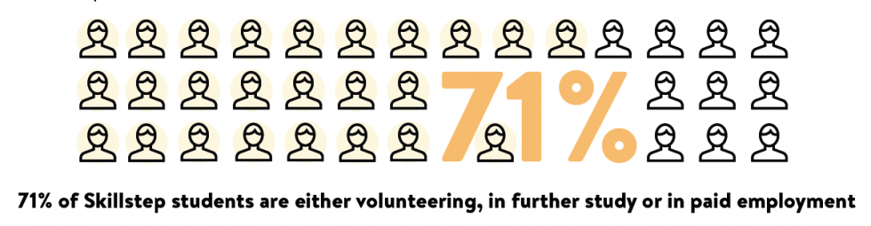
This is a simple one, just taking one % and colouring the same number of the figures to bring the stat to life:
This is one of my favourites. Not ‘data’ technically but a great way to visually highlight the return on investment within a charity report. 
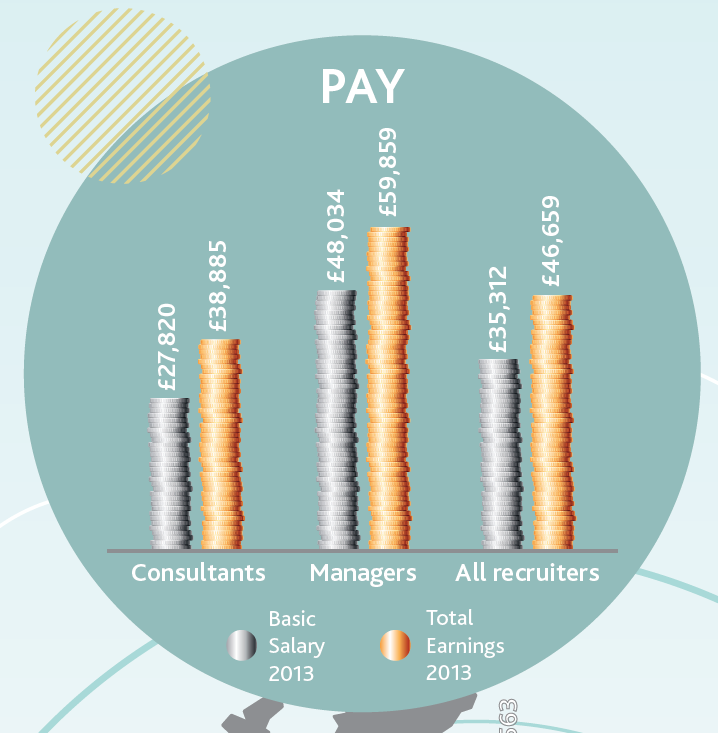
Another example using coins, but in a different style. This is just a bar chart, but by using the stacks of coins it immediately gives the viewer a visual clue that the chart is going to be about money.
Do ensure when you’re creating your images with data that your maths is correct. We usually create the actual chart, using the figures, in excel and then work over the top of it to make sure the final image is correct. Get the final figures before you start though or it can mean tough amends!
Putting it all together
We always draw out our idea first to make sure it’s going to work as a picture all together. It definitely saves time as it’s easier to change a sketch than a finished design.
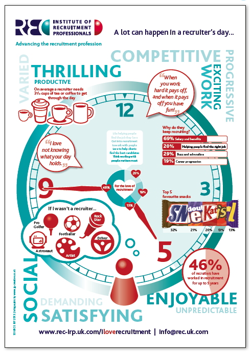
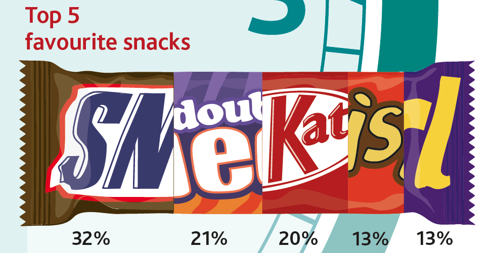
This example showed the results of a survey that the IRP had done with Recruiters about what they did in a day.
We based the concept around a working day – ‘9 to 5’, shown on a clock face, with the results to the question about what they’d do if they weren’t a recruiter in the space outside of work time. We placed the drinks info at about 10am and the chocolate stats mid-afternoon – very appropriate.
I especially like the mash-up of chocolate wrappings, which we drew from scratch and are exactly the right % or each. Now that’s attention to detail!
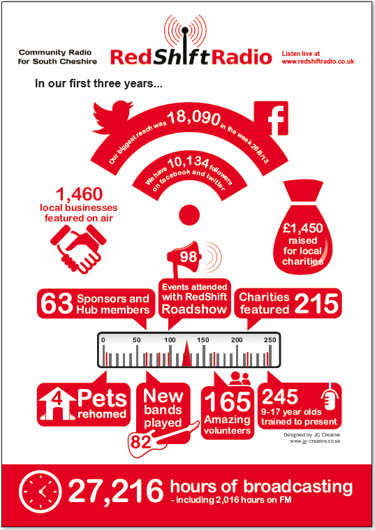
This one uses graphics from the clients logo and a radio dial as an appropriate mechanism to ‘hold’ all the information. Charts and graphs weren’t relevant here as there wasn’t comparative data to display. For example 50% or 1 in 3. It was just figures so having a visual device to bring them together is visually very useful.
If you want to learn more about Infographics you could go on the Guardian’s one day Data Visualisation course. I did, many years ago and it was fantastic. Information is beautiful also have some workshops coming up, as well as developing some online webinars, great for those of us outside of London! Sign up for info here.
Talk to us about visualising your data in an infographic – they are one of our favourite things to do! Call me on 01270 626624 or email Jo@jg-creative.co.uk. Speak soon!
Blog by Jo Grubb, owner and Creative Director of JG Creative.