When Nicki and Jo are designing on screen they’re always imagining how it will look when seen by the audience. Often that means when they hold it in their hand, either as a printed leaflet or on their phone as an app or website. Today I’m talking about printed materials because its a big area to understand and there can be a lot of jargon to decode! Always ensure your designer advises you on the best material for your message to bring it to life. Humans are tactile creatures and the touch and feel of materials helps with engagement and understanding.
In this blog, I will aim to demystify some of the language we use when talking about print by taking you through some of the different materials and options out there.
Paper
Paper weight is measured in GSM. This is stands for ‘grams per square metre’. It allows you to choose the thickness of paper that is right for your job. The higher the GSM number, the heavier the paper.
For example the paper you put through printer at the office is traditionally 90gsm. Heavy card, for example your business card, is probably 350gsm.
For an A5 leaflet, we would recommend it be printed on about 250gsm so it feels good quality. If a leaflet is going to be folded, a slightly lighter paper weight of 180gsm is appropriate as it will be doubled up when someone picks it up. Top tip! If you produce a leaflet on a heavier paper stock, people are less likely to discard it without reading it.
You don’t need to just have one paper weight per item either. If we are producing a booklet which has several pages, we’d often print the cover in a heavier weight than the inside pages as this gives it more rigidity and makes if feel more like a book.
NOTE – any booklet which has multiple pages MUST have a number of pages that’s divisible by four. This is because when a sheet of paper is folded in half it creates 4 ‘pages’. We’re often asked to add two more pages to a booklet and it’s just not possible. They’d fall out!
Stock
This just refers to the type of paper. There are lots of different paper types but generally you’ll be offered one of three main finishes which really change the way the design will print:
Uncoated stock feels thicker than paper that’s the same weight in a different finish because it hasn’t been flattened so much by the rollers during production. It give a more homemade and ‘recycled’ feel which is very popular at the moment. It’s also non-reflective so is chosen for accessible jobs aimed at people with a visual impairment. Be aware that the paper is very absorbent and will soak up some of the ink during printing, meaning your colours and especially photos won’t look as bright as they did on screen. Our designers compensate for this by upping the saturation on the images before they go to print (my simplified description of their technical process!).
Gloss stock is the opposite end of the spectrum to uncoated as the paper has been flattened extensively to create a heavy sheen. Colours printed on this paper come out very clearly and brightly and it’s great for designs which are heavy with photos. It’s literally where the phrase ‘glossy brochure’ comes from. Be aware that smaller text, or any areas with low contrast (where the text and background are a similar colour) may be difficult to read due to the light-reflecting effect.
Silk stock falls in the middle of uncoated and gloss which is why it’s by far the most commonly chosen paper. It gives a more subtle, sophisticated sheen than gloss, while also printing colours more brightly than uncoated. A perfect hybrid!
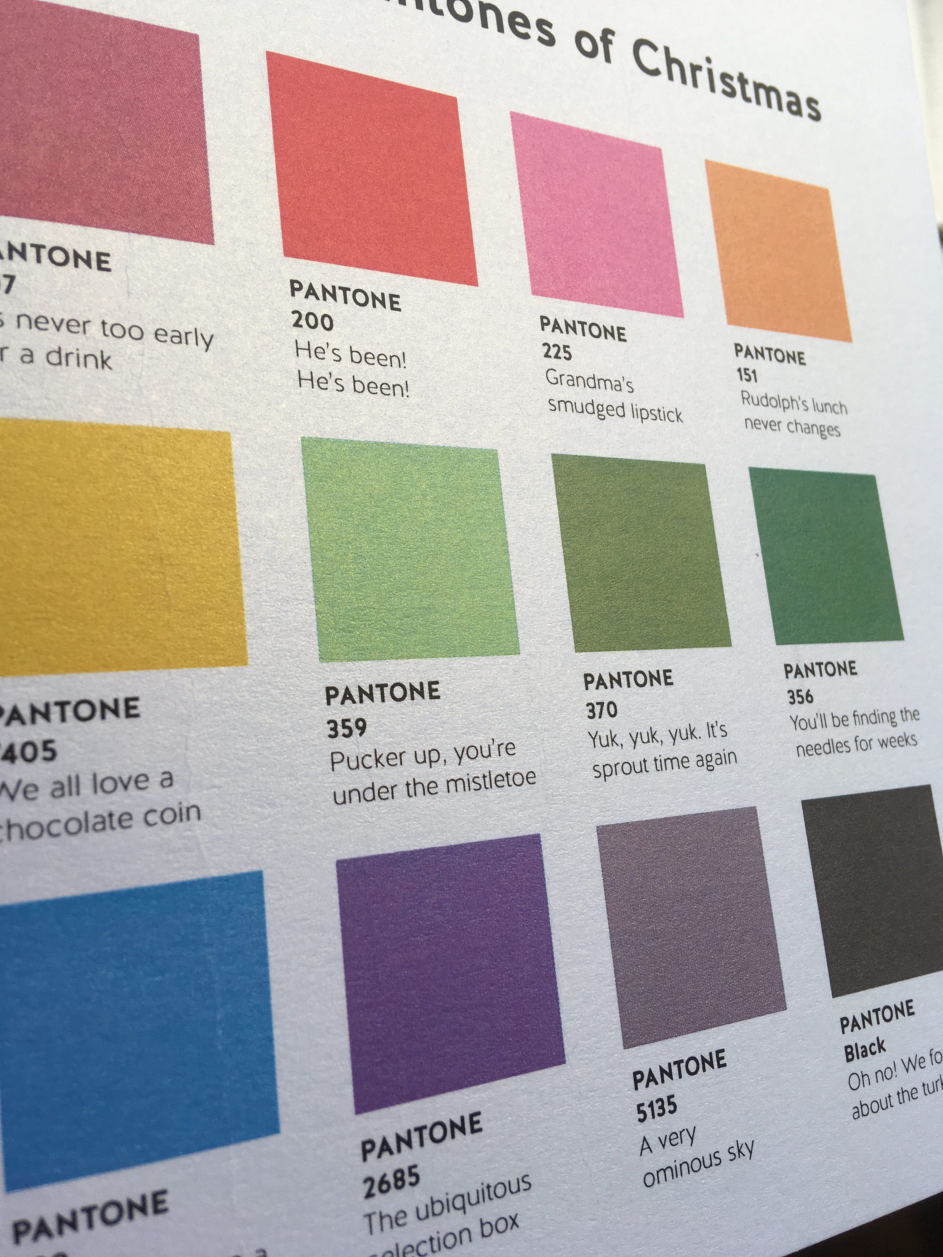
 The paper stock itself can come in a rainbow of colours. For our recent Christmas card, we chose ‘ice gold’, a heavier stock with a subtle metallic sheen running through it. This gave the card a premium feel and helped the design feel Christmassy!
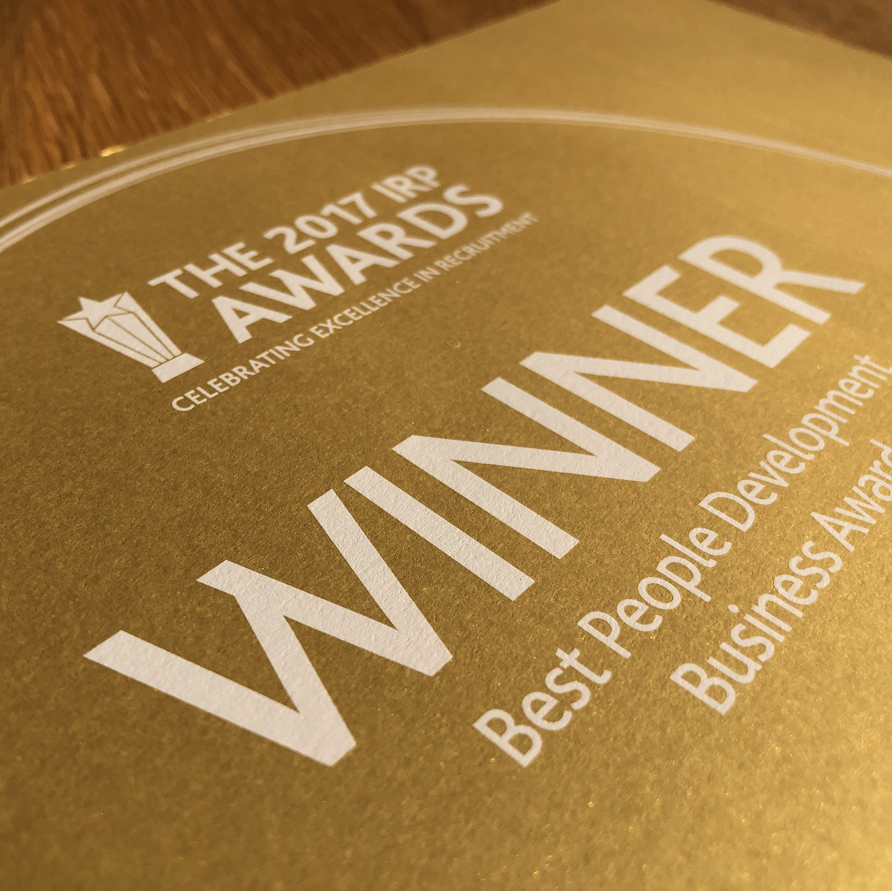
White ink is an exciting new printing process to apply to coloured stock. Traditionally, dark ink is applied to light paper, but here white ink is applied to dark paper or areas of print. This simple reversal of the norm is a great way to stand out. White ink was used on gold paper certificates we recently designed for the IRP Awards evening.
Finishing
Whatever stock you choose can also be altered by the finishing. This includes laminates over a whole cover, spot UV in a specific area, die cuts to get bespoke shapes and foiling to make beautiful metallic areas. This is a whole area we’re going to cover in a future blog (spoiler alert).
 Vinyl
Vinyl
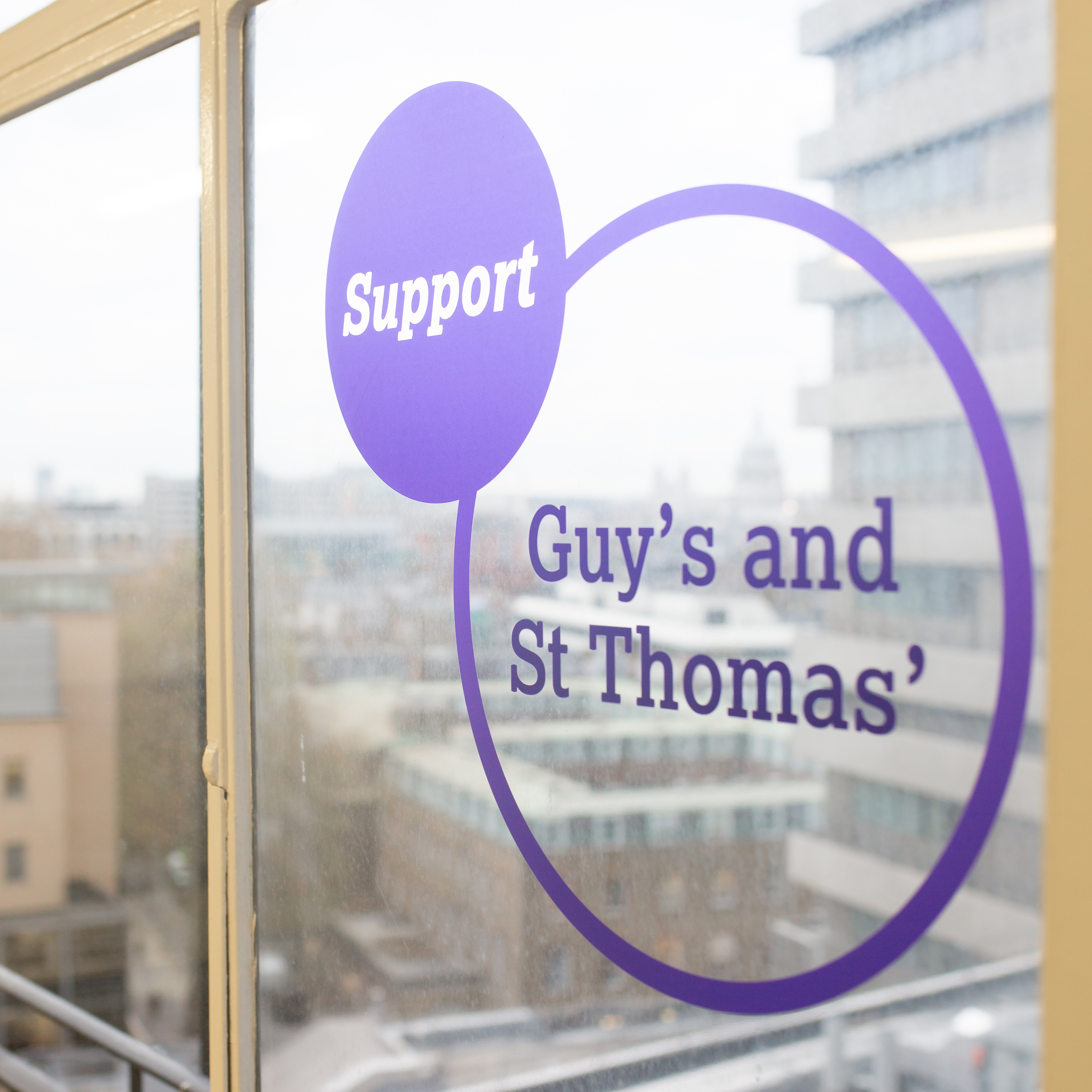
Moving away from the more traditional materials, vinyl is a thin plastic, adhesive-backed material which can be stuck onto any glass or wall surface. It’s straight forward to fit and depending on the material you have chosen they can even be re-positioned or removed without leaving residue behind. This material is often used for large formats, like wall graphics and window displays.
Vinyl was used for the Guy’s and St Thomas’ and Evelina London Children’s Hospital wall graphics we designed. They really stood out and were able to be seen from both inside and outside the hospital.
Polyprop
This is a plastic board often used for folders and which has its thickness measured in microns. If you need a rigid folder, with a D-ring mechanism in to hold lots of sheets of paper then you’re looking at about 1,200 micron thickness. These can be digitally printed on like paper and also die-cut and scored so that it can be folded to make box files too. Lots of possibilities and very robust material for the right job.
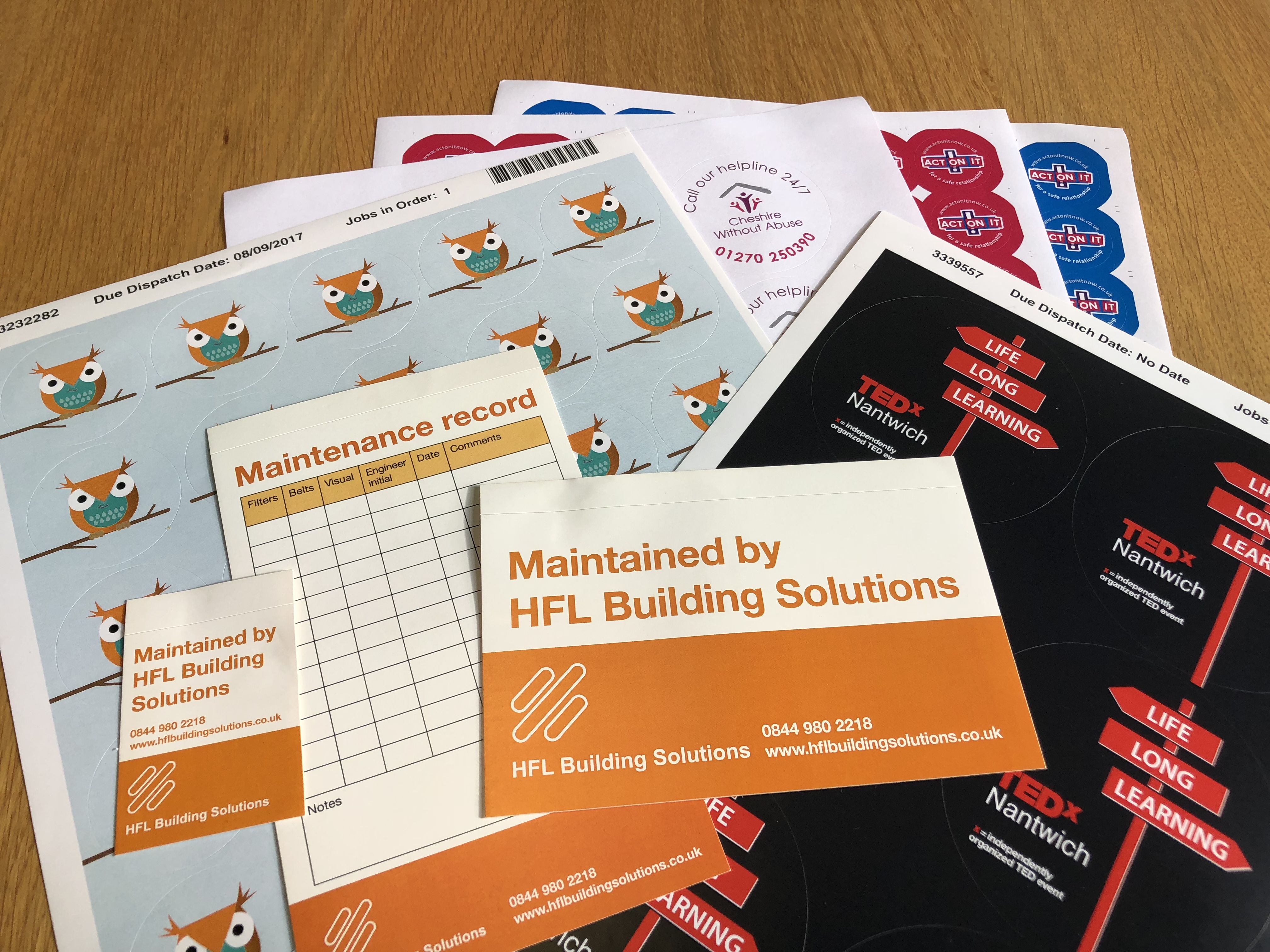
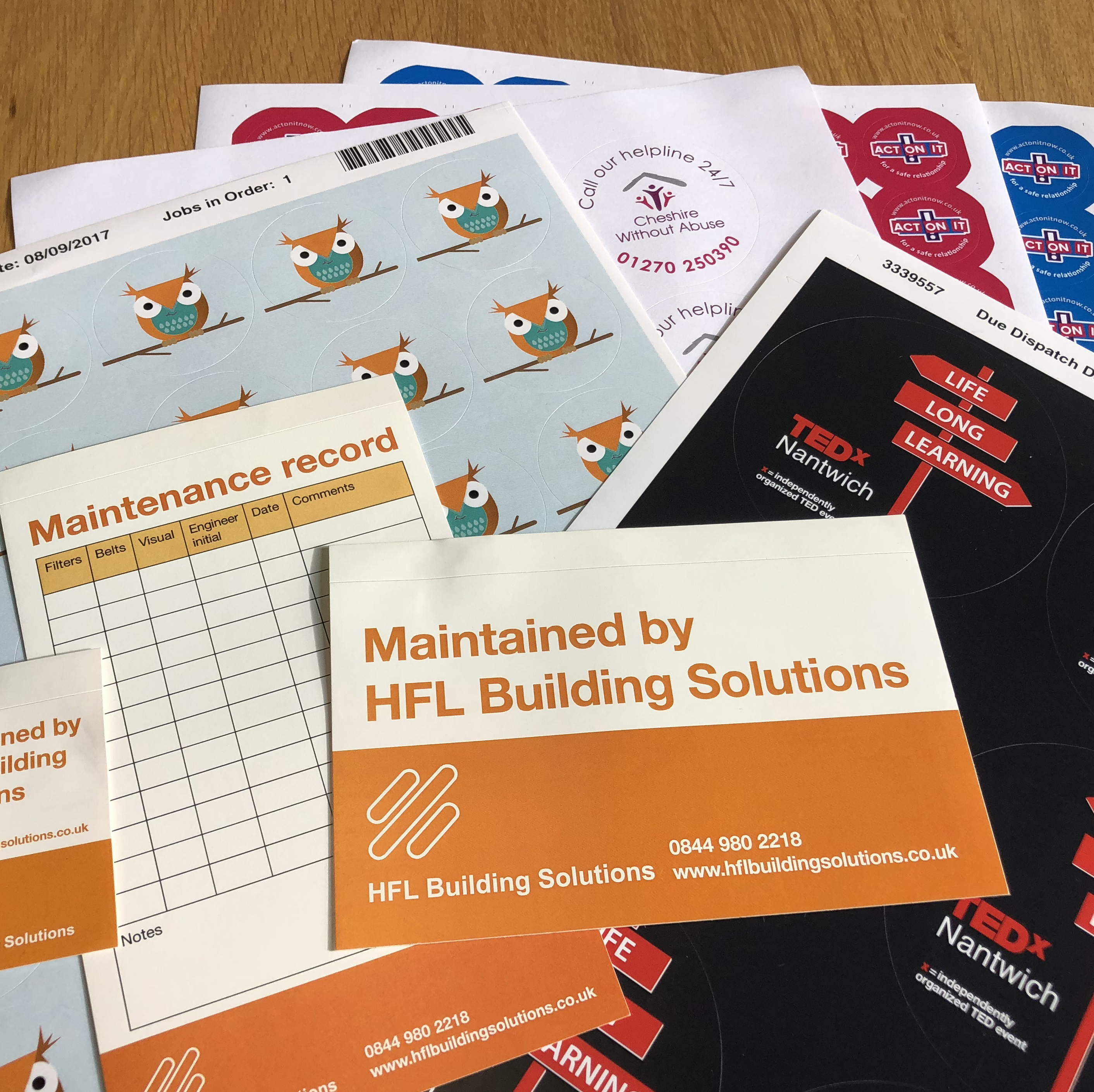 Stickers
When we say stickers, do you think of the small round ones that are given to children at the dentists? Well they can have a much wider use than that! Stickers are a simple and easy way to brand all your items. We’ve designed hard-wearing stickers that are used by electricians to declare something as ‘tested’, as well as the traditional small ones on sheets to be given out on open days. The possibilities are endless!
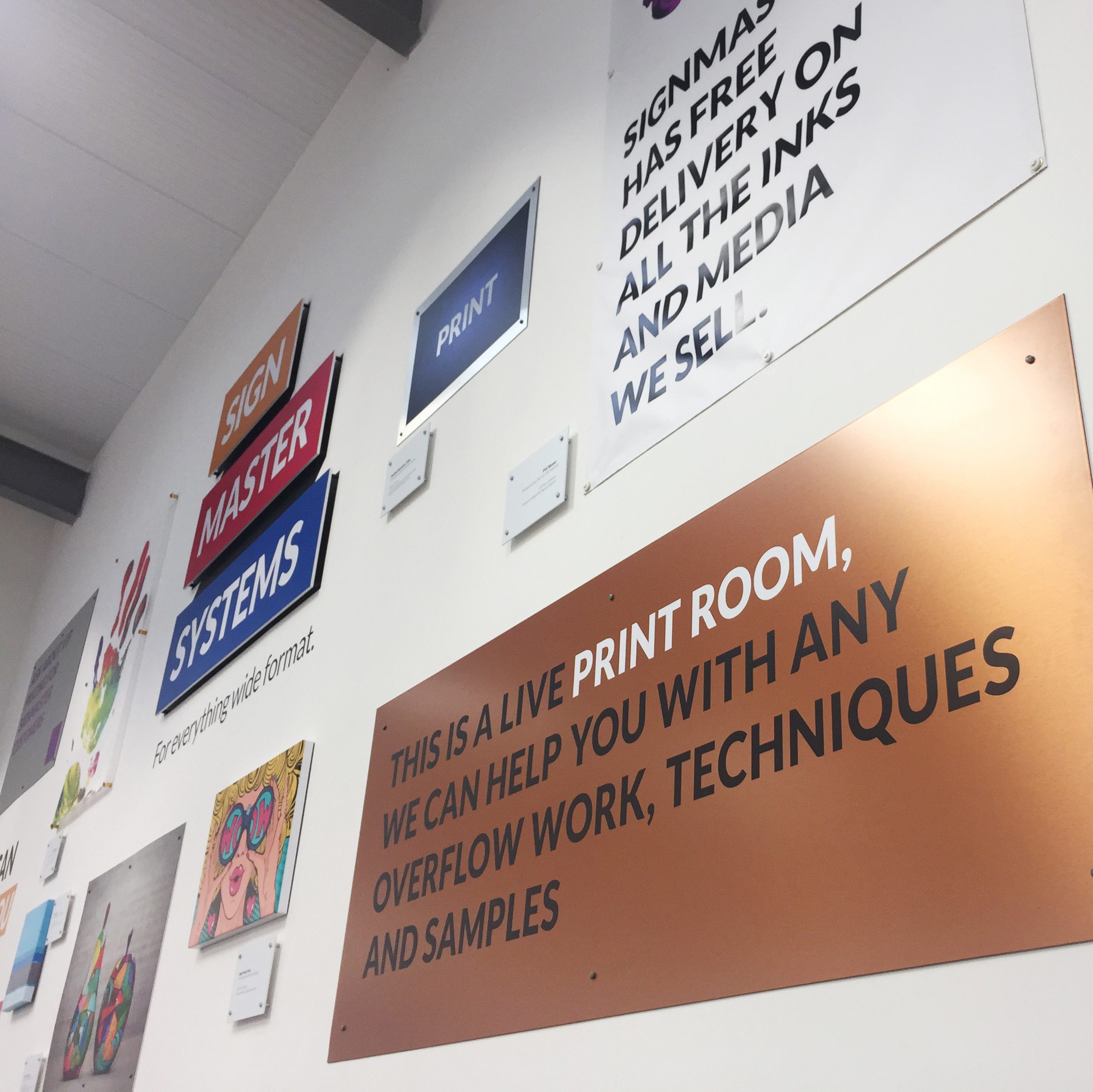 A myriad of materials!
Never have more materials been used for one project than the one we recently completed for Signmaster Systems! Our concept to brand their new office space was based on an art gallery, which gave us an excuse to put large pieces of ‘art’ on the walls using every material that can be printed on the printers they sell. From printing on copper sheets to canvas, they fully made use of the different materials available!
See more about the project here.
The material you print on is an important decision and shapes the design process and finished product. I hope you have found this blog useful in introducing some of the terminology to you. Do ask us if there’s anything else you don’t understand.
 If you have a design project in mind that you would like to discuss with us, get in touch on 01270 626624 or email alison@jg-creative.co.uk