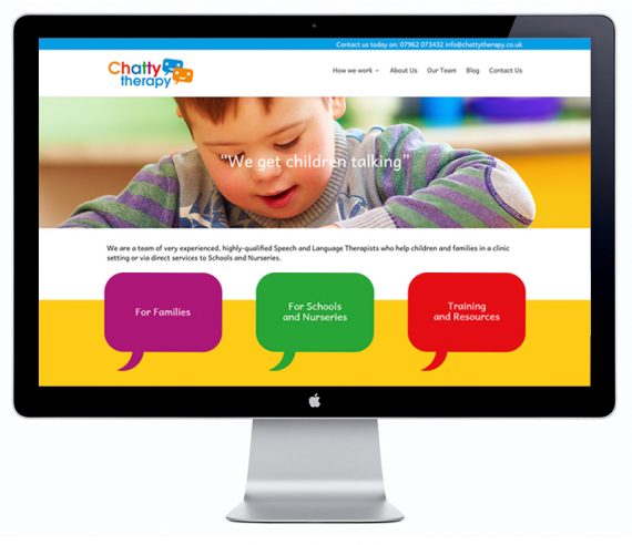
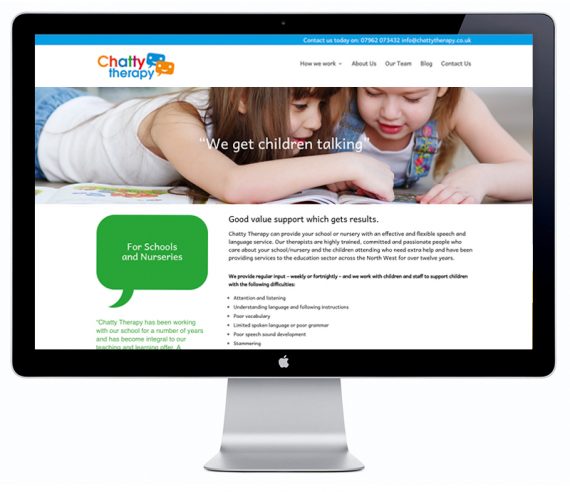
Carole from Chatty Therapy came to us wanting a new website to present their speech therapy and language services in a professional, clear and succinct way.
She wanted it to be easy for everyone to read, as she knows first-hand what a barrier dyslexia can be. We used a dyslexia-friendly font and added yellow to her palette which can help with legibility of copy when used as a background colour. Her fabulous existing colours, taken from her logo brought the site a sense of fun, coupled with the photos we sourced showing children looking like they’re engaged in therapy or reaping the benefits of the support. After all, as Chatty Therapy say “We get children talking”.
How did the client enjoy the process?
“I found it a pleasure to work with Jo and her team. They were approachable, patient, imaginative and empathetic.
I am really pleased with the look and feel of my new website and feel that it perfectly reflects my business mission and aims. I will be proud to tell people to look at my “Chatty Therapy” website now”.
See the website here


