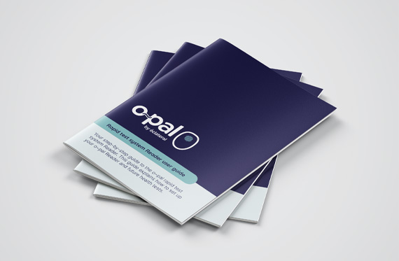
éclateral are a tech company with a focus on accessible healthcare. They have devised and developed an innovative hand-held device that allows anyone to perform health tests in their own homes. We have been working with them to develop their company and product branding, brand guidelines, packaging and website.
The branding we’ve developed for éclateral uses a logo formed from a stylised ‘e’ in the shape of a light bulb, which is synonymous with intelligence and innovation. The bright yellow colour is arresting and bold, offset with a mid and dark blue to really show it off!
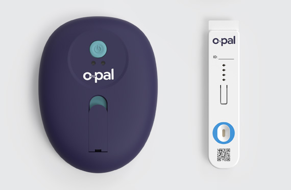
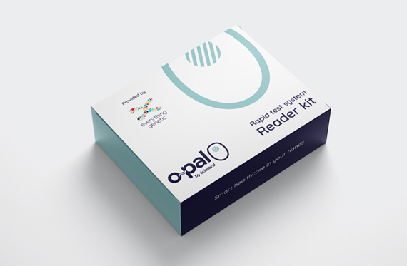
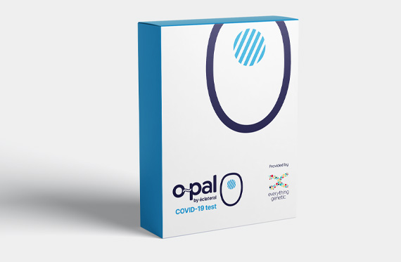
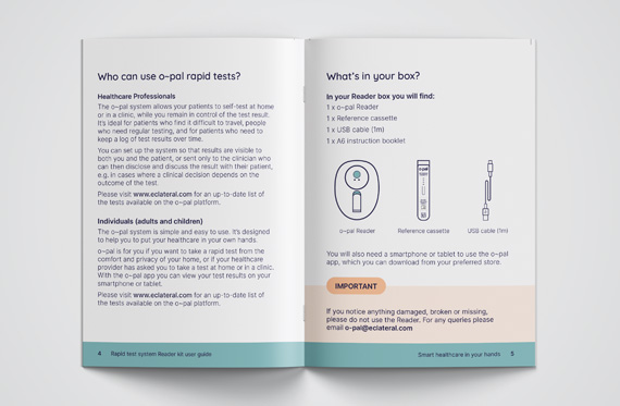
The especially exciting bit for us was helping to develop their product and test kit. We really enjoyed working with the product designers and app developers to come up with the name, look, colour and style of the actual product. We’ve also developed packaging and instructions for use for o~pal.
Supporting this is possibly the most comprehensive set of brand guidelines we’ve ever done, covering the company, the product and all the test kit brands, to ensure it remains consistent across all their communications. We have also recently launched their website designed for potential funders and partners.
éclateral’s CEO and Founder, Dr Paul Ko Ferrigno was kind enough to say:
“JG have been at the heart of our marketing plans from the beginning because they immediately understood the Company’s nascent message and mission and quickly developed a clean, strong and authoritative colour palette that has gone across really well with focus groups, future product users, potential partners and investors. They’ve taken that message and turned it into a series of bold taglines that are now the headlines on the website they’ve made for us. They’ve been proactive and responsive throughout making them great commercial partners as well being people whose own values align with our own. Two thumbs up, five stars, highly recommended!”


