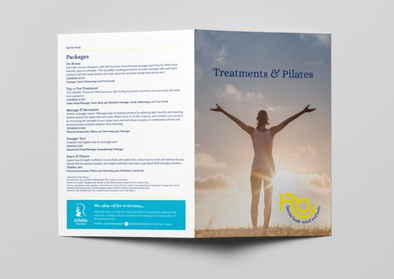
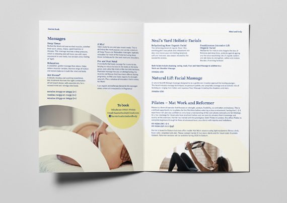
At the end of 2019 Harriet approached us needing a new logo for her Pilates, Wellness and Massage business.
Our brief was, “I love yellow, don’t be afraid to do something different and show the connections I have with my clients.”
Harriet’s initials (h + b) when written in lowercase have beautiful symmetry, and we knew we could use these to create a strong visual identity. Using Harriet’s initials intrinsically links her to the brand, also fulfilling the brief we were set.
Each letter shape was drawn individually using a series of circles joined together to work in harmony with each other, resulting in a logo based on movement and flow, representing her business perfectly.
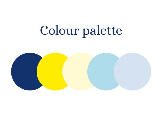
This was teamed with a balanced colour palette, using a bright yellow as the primary colour and blues to calm and quieten.


