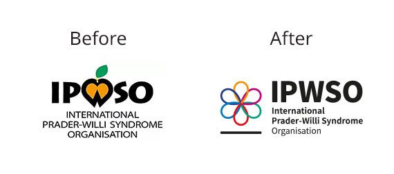
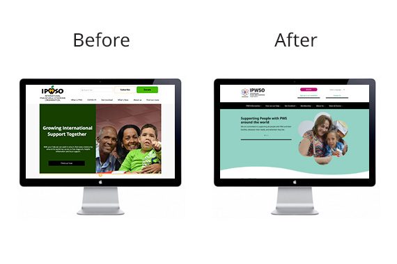
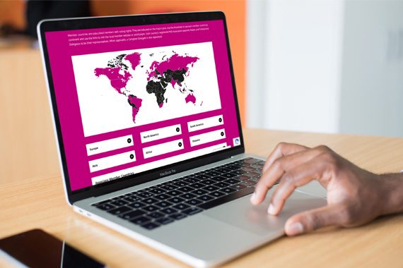
Last year saw us rebrand and launch a comprehensive new website for IPWSO – the International Prader-Willi Syndrome Organisation.
The new logo is made up of 6 shapes representing the continents IPWSO work across to highlight their global reach. The shapes are linked to communicate their aims, goals and achievements in uniting the PWS communities across the globe. The six distinct colours show that Prader-Willi syndrome is not a selective condition, it affects all genders, cultures and ethnicities equally.
The new website was key to the rebrand. Their aim as an organisation is to provide high quality information and support to families, professionals and caregivers regardless of where they are in the world and their previous website did not have capability to allow them to do this.
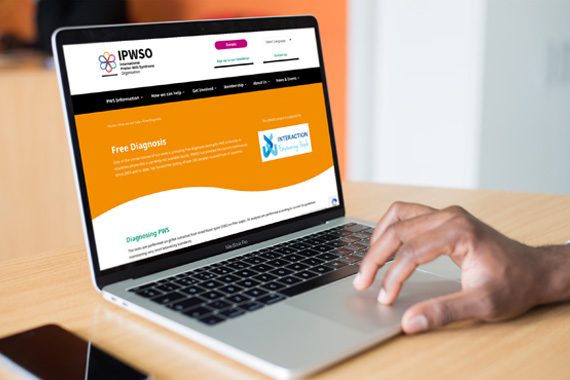
The new site launched on time and on budget in late November 2020 and features: easily accessible information on Free Diagnosis; how to become a member of IPWSO; translated articles to download for families and medical professionals and the entire site has the capability to be translated into any language from around the world. It is also simple to update and can flex according to the organisation’s needs in the future.
Agnes Hoctor, Communications and Membership Manager at IPWSO said of working with us:
“We asked JG Creative to redevelop our website to make it easier for us to share our resources so that families and professionals around the world can access the information they need about Prader-Willi syndrome. At the same time we asked them to redesign our logo to better reflect where we are as an organisation as we enter our 30th year. We have been absolutely delighted with the work and have received lots of lovely feedback on both the logo and the website. It has been a difficult project as we are an international organisation juggling different languages and audiences but Nicki and Jo have been very creative, patient and helpful throughout the process”.

