 As graphic designers with MANY years of experience between us I think it’s fair to say that we’ve probably seen more brand guideline documents than most people. We have to absorb brand guidelines, pull out all of the key information and then ensure the designs we create follow them.
Easy right?
Erm no, not in most cases. Want to know why?
Because a lot of brand guidelines are missing one important section. They don’t include examples of the brand in use (or X-amples for the sake of ensuring the headline fits into our A-Z theme!).
The guidelines could be crystal clear about where the logo goes and what fonts and colours to use. They could even give us some fab images to showcase. But if we can’t see how you want all of those elements to come together in a way that is uniquely ‘you’ then we can’t possibly replicate it.
In cases like this we will usually look at your website, review your social media and search around for any examples of your documents that are out there so we can ensure that we have the reference we need before we begin.
And you you know what we find 90% of the time?
Big inconsistencies in how all the elements of your brand have been applied. Because the previous designers didn’t have clear guidelines on how to apply your brand either!
So when you’re putting your guidelines together (find more info on that here) don’t forget to include lots of (e)x-amples on how you want your brand to be applied. You’ll make your designers very happy. And who wouldn’t want that?!
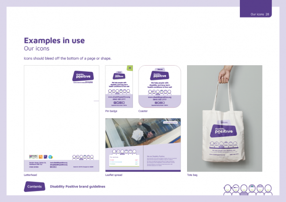
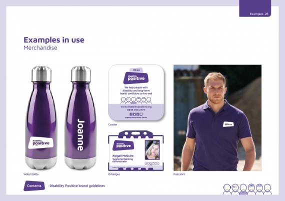
Here are some good examples of the brand we created for Disability Positive:


For a new brand the examples page might be simple but ensure you revisit it over time to add new good examples as they are created.
Consider showing examples of the brand being used in different ways – Digital, printed leaflets, signage, merchandise even animated or video. Whatever you use and want to ensure consistency of.

