 If you’ve been reading these blogs for a while then you might remember I did ‘G is for Guidelines‘ in our A-Z of design. Well spotted! So why am I writing it again?
Because I didn’t cover everything. Deliberately, I might add! Last time I focused on all the elements you might want to include in your guidelines that are design related. Logos, colours, fonts, images and examples of the brand in use. Do go and have a read if you haven’t seen it.
For this A-Z of brand we’re delving deeper. We’re looking at all the other elements in your guidelines that are brand related. We went through these in B is for Branding and your guidelines should be where the results of those decisions live. The one point of reference for the whole organisation so that how you communicate who you are is consistent and authentic.
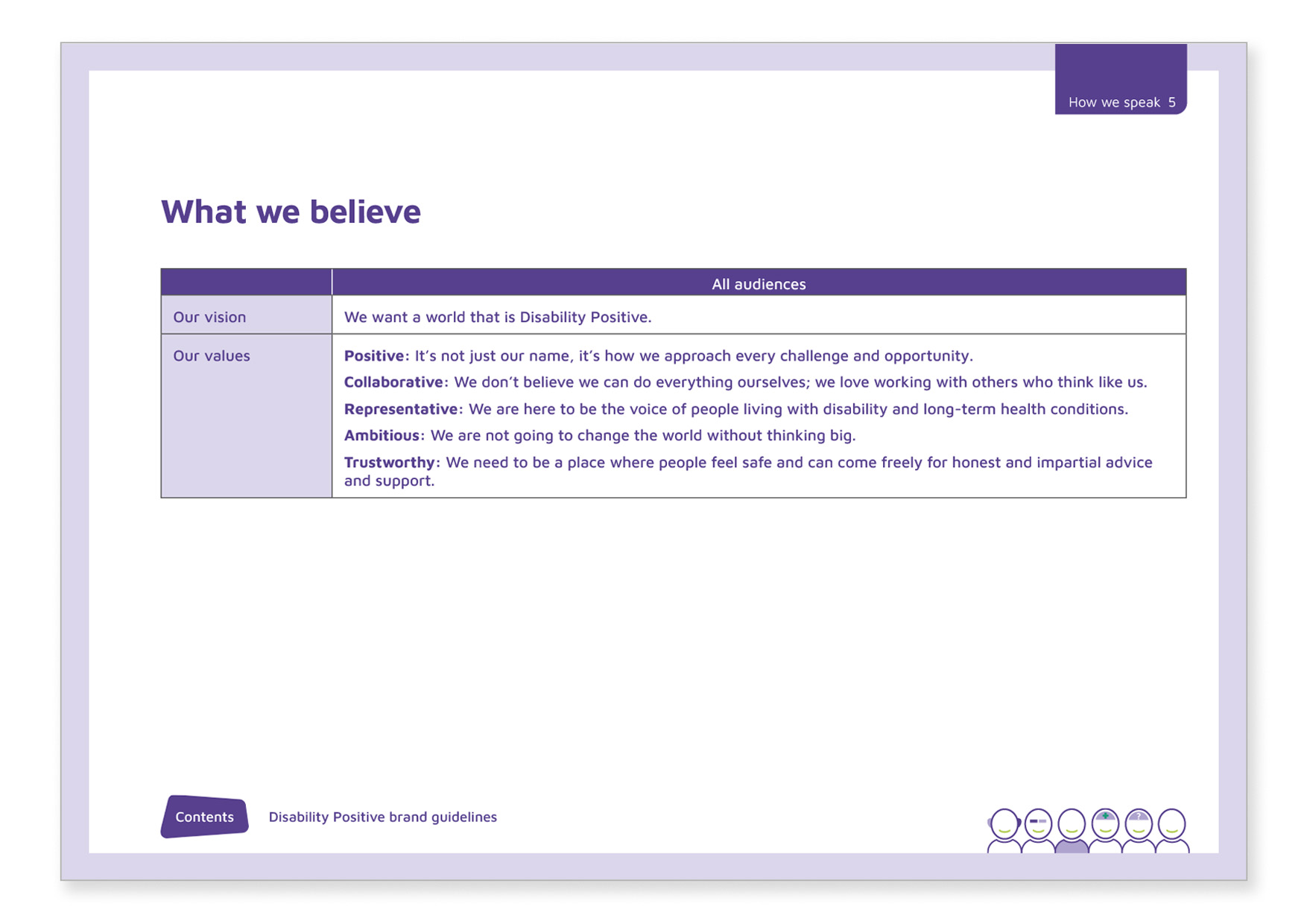
Vision and values
State your goal as an organisation (your vision) and how you behave (your values). This is so valuable for both staff, volunteers and agencies you are working with, to ensure they understand your aims and can work with you towards them.
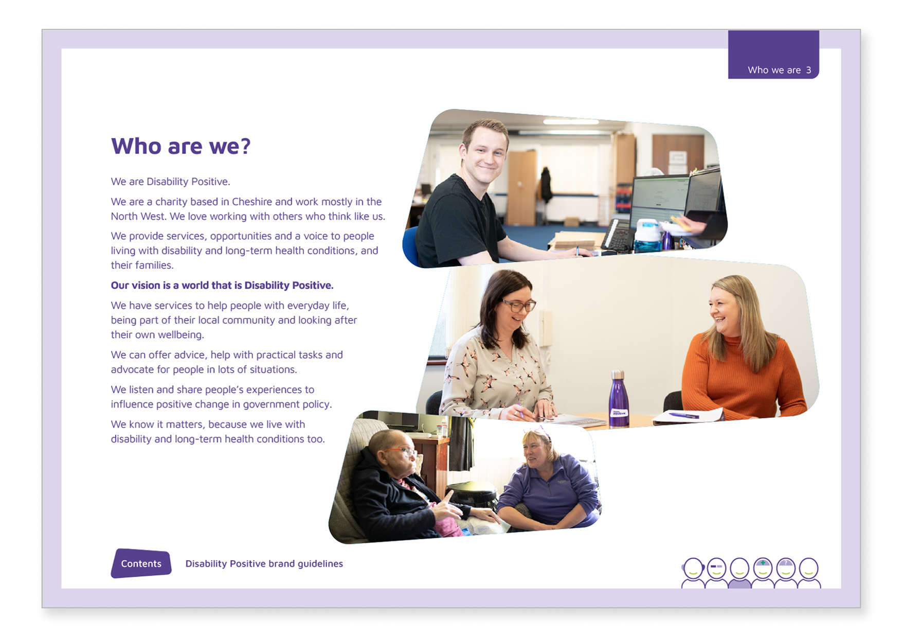
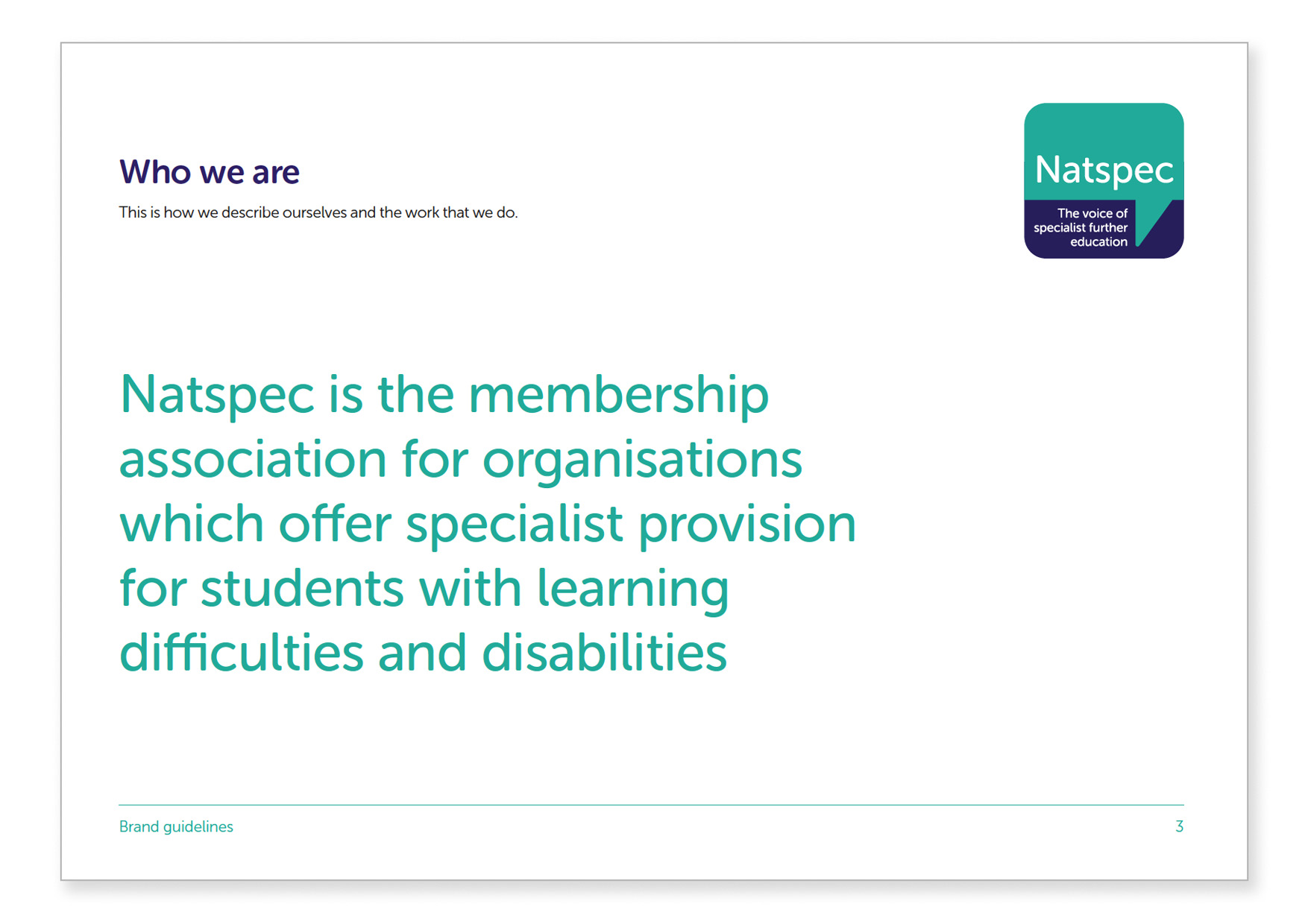
Who you are
It’s always polite to introduce yourself when you meet someone new! Having this text written down means you can introduce yourself consistently across your website, social media, in proposals, leaflets and in person. This clarity in explaining who you are and what you do makes a real difference to the people you meet. Sometimes organisations write short, medium and long versions of these which can also be very handy.
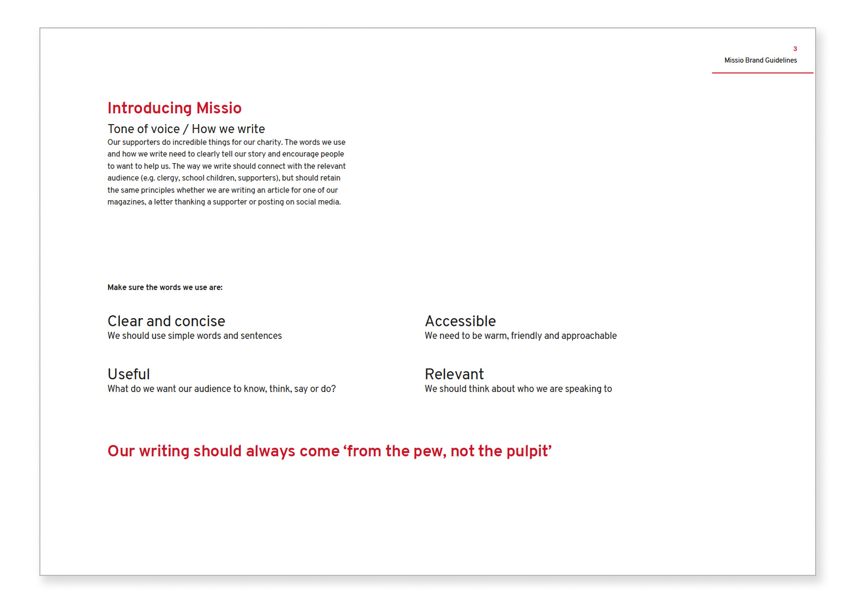
Tone of voice
Having an established tone of voice can empower staff to create amazing copy, since they know how it should sound. It is incredibly difficult with lots of people writing for the same organisation, all with their own way of speaking, to maintain consistency without this. Sometimes these pages can include useful phrases and words not to use too – but don’t make it too complicated!
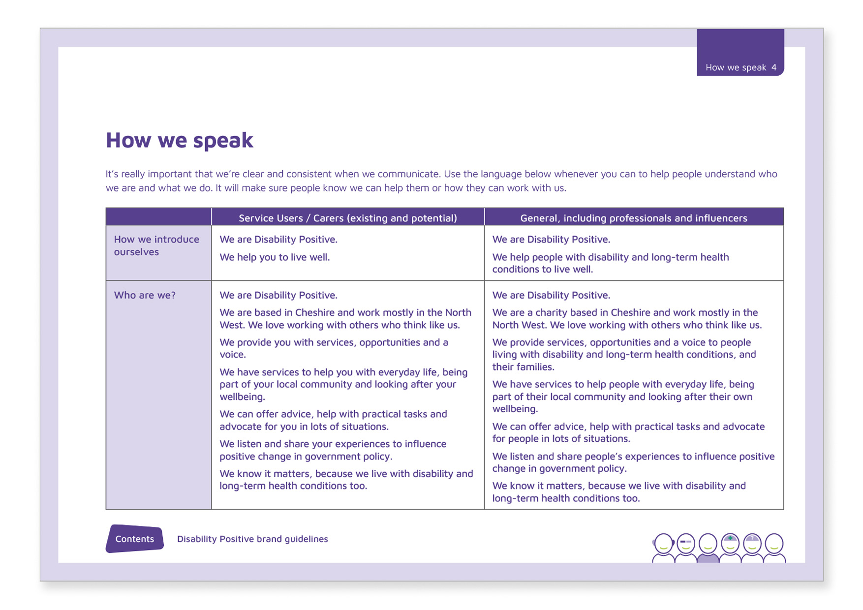
Messaging
Writing out your key messages, those bits of text you say a lot, can save everyone time and ensure you sound consistent.
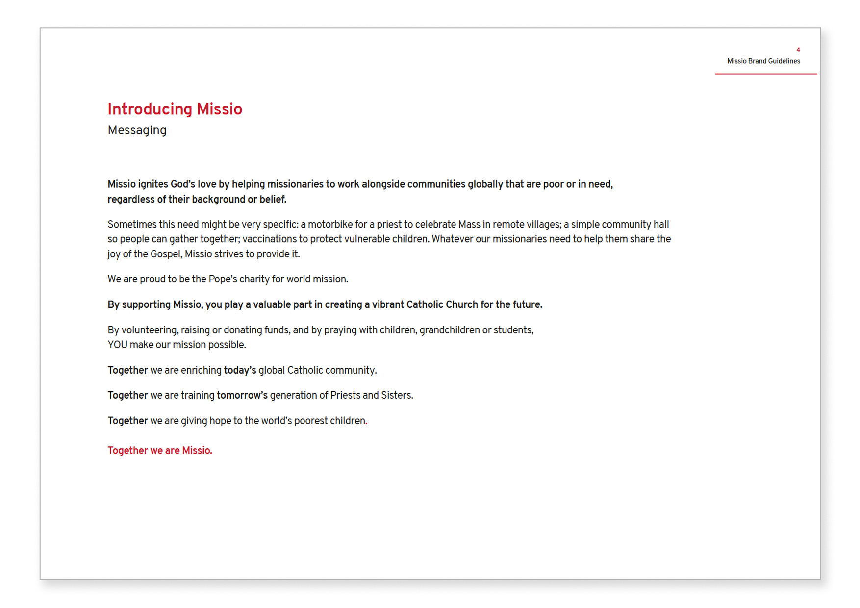
Writing them for different audiences too saves even more time and really helps people to think about who they’re communicating with.
Include your workings out
Even on the ‘design’ pages we do in brand guidelines now we include the ‘why’ behind the design decisions. It’s so useful for people to understand where the idea came from so if they need to amend or expand on it they can work towards the same goal.
![]()
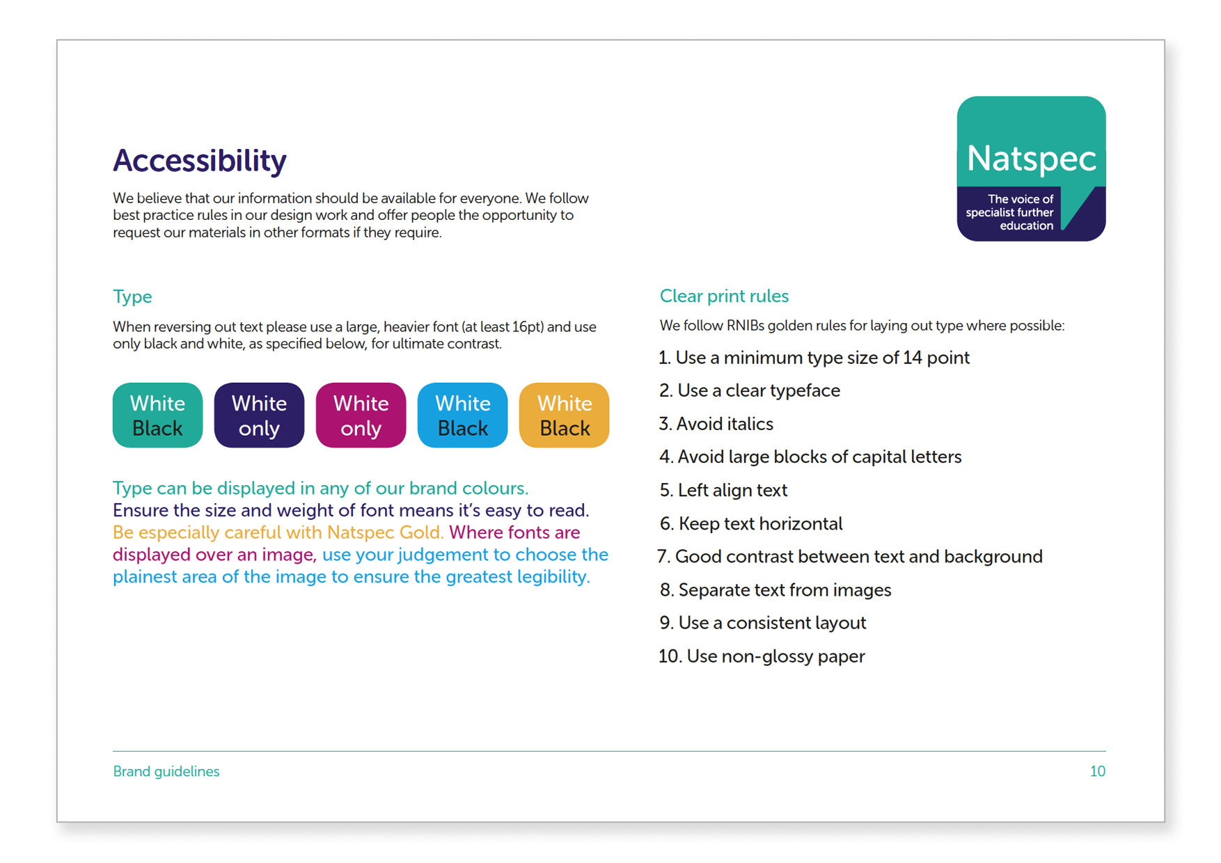
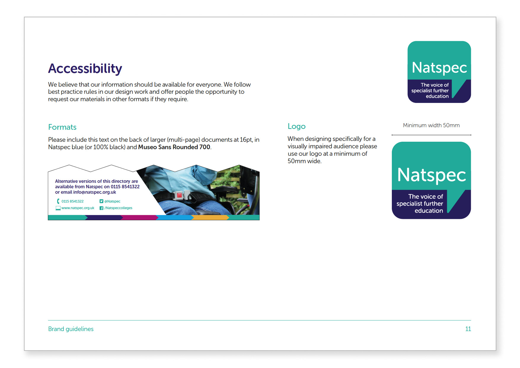
Accessibility
If your values include giving everyone equal access to your services then that needs to apply to your brand too – in my ideal world everyone would be doing this! Include these pages to be clear about what standard of written communication that you aim for and you can extend this online and in built environments too.
Check list
- Vision and values
- Who we are
- Tone of voice guidelines
- Key messages
- Logo
- Colours
- Fonts
- Images
- Brand elements
- Accessibility – ensure your brand is for everyone
- Examples of the brand in action
- What not to do – you might add this page to your guidelines later if you are finding that people are making common brand mistakes
- Contact details – make it clear who to contact with questions and what your approval process is for sign off.
We created all the examples above for our fabulous clients Disability Positive, Missio, Natspec, Guy’s and St Thomas’ Hospital charity and PANDAS Foundation. If we can help you with your branding please do just get in touch.
Some other fantastic examples of brand guidelines (which we didn’t do) are RNLI, Oxfam and Unicef. These include all the elements I spoke about above, and more.
Now read H is for Humans
 Jo Grubb
Managing Director, JG Creative
