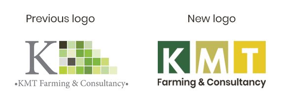
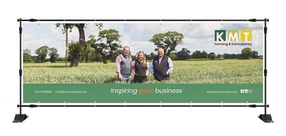
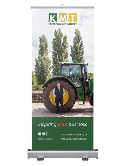
KMT Farming & Consultancy approached us with the challenge of helping them with a brand refresh. Their current logo was quite dated, using several green blocks which are hard to consistently replicate and a serif font in a light grey which was hard to read.
Our brief was to make the logo more attractive to its audience, appropriate for its business and distinctive in its sector.
The new logo we created combines three strong coloured squares with the letters K, M and T to ensure the name itself is at the forefront. We chose a rounded font which is friendly and interesting whilst still being professional.
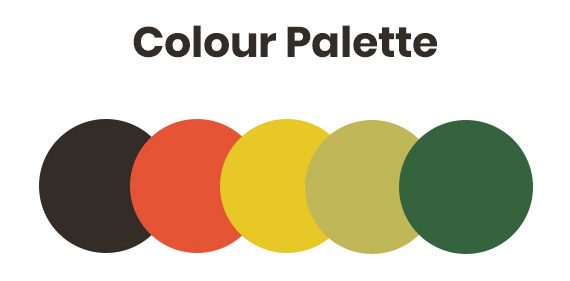
The colour palette was developed through a professional image supplied by KMT which is often a good way to source a range of colours as they already exist together in real life. From this, we carefully selected a range of tonal and complementary colours to form the main colour palette.
This project has given KMT Farming & Consultancy a recognisable brand and more visual consistency in their approach.
The KMT team are delighted with their new logo and said of working with us:
“We enjoyed the whole process and the team at JG have been fabulous. We are now working with them to redesign and relaunch our website”
We love a good chat about branding, so please get in touch if you feel you’re in need of a refresh!

