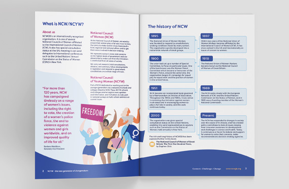
The National Council of Women of Great Britain (NCWGB) was founded in 1895 as a response to the unsatisfactory working conditions faced by many women at the time. Known as the National Union of Women Workers, the organisation quickly developed into a nationwide network of small groups, and within two years had become affiliated to the International Council of Women (ICW). It has since worked in the UK and internationally on issues of concern to women
“The prospect of a rebrand for our 125 year old organisation was challenging! Members were used to the existing image of their organisation and the new brand had to incorporate the best of the old while moving us forward.
When we started to work with JG Creative we quickly realised that not only were we in safe, professional and experienced hands but that the team at JG Creative understood our needs and cared about the issues we stood for.
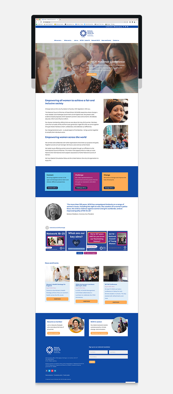
They guided us through the process of revisiting our vision and values so that we had a clear idea of how the new brand needed to reflect our future path. Together we interpreted our vision to be fit for the next 125 years. The logo has been redesigned to keep the overall feel of the old logo but to be a very clear step into our new look. Our website has been completely rethought, redesigned and rewritten to be the ‘go to’ place for information about NCWGB and to keep members and others up to date with what we’re doing.
JG Creative were both proactive and supportive in this process. Their can-do approach has been invaluable and gave us confidence as we worked through the various stages of the rebrand. We have been delighted with the outcome of all the hard work which has been well received by our members. JG Creative have been a pleasure and inspiration to work with and we know we will continue to work closely together.”
Jill Rogers, NCW Trustee.
We began the process of rebranding by undertaking research to gain a clear understanding of current perceptions of the brand with existing members and target audience. Exploring and defining how they feel about the organisation and its strengths and weaknesses. Both online and offline surveys were sent to existing members, while the existing website and social media channels were used to distribute an online survey to the potential target audience. We also conducted online focus groups which allowed us to investigate current motivations to join NCWGB in more depth, to explore the most appropriate tone of voice and the authenticity and credibility of potential language in more detail and to identify any potential gaps between current perception and desired vision and value. Key research findings and recommendations were fed into the brand brief, the website restructure and development of an appropriate tone of voice.
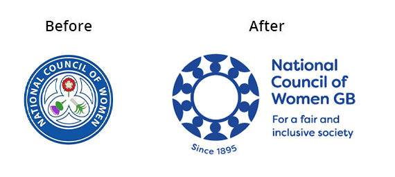
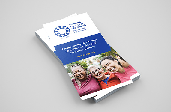
The new branding maintains their key brand colour and introduces a set of four bold, feminine and arresting secondary colours. The logo retains their recognisable round shape, but rather than using the flowers from the three countries of the UK our design focuses on the coming together of people to represent the strength of the NCWGB. This is accompanied by a new strapline ‘For a fair and inclusive society’, taken from their vision.
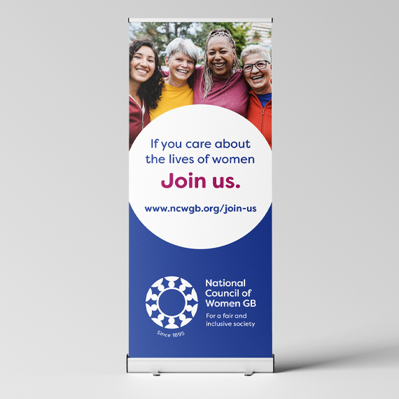
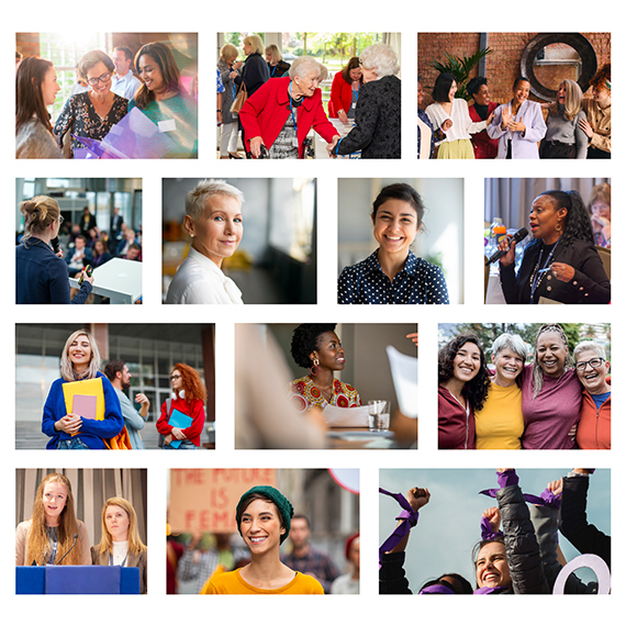
Their photography now shows women in real-life situations; in academic scenarios, in loving and caring roles alongside powerful, aspirational roles. They show a broad age range and are as divers as the women in Great Britain are. We also introduced an illustrative style just to be used for National Council of Young Women (NCYW) materials. This branding now extends to their new website, leaflets, banners, social media, corporate stationery and newsletter templates.
We worked with their Management Team closely to keep their members up to date with the changes and give them genuine opportunities to input into the process. The launch last month was very well received and they’re looking forward to their first in-person AGM for a few years at the beginning of 2023 to immerse members in the new-look National Council of Women!

