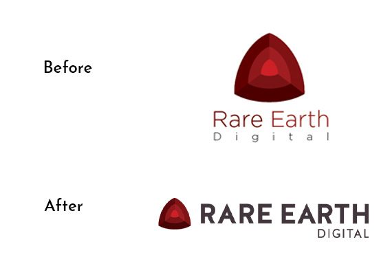
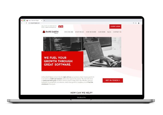
Rare Earth Digital approached us to design the front-end of their website and give their logo a refresh.
Being software developers, their current website was technically very sound, but looking outdated visually, and it also didn’t accurately represent the type of projects they are involved with, or their scope.
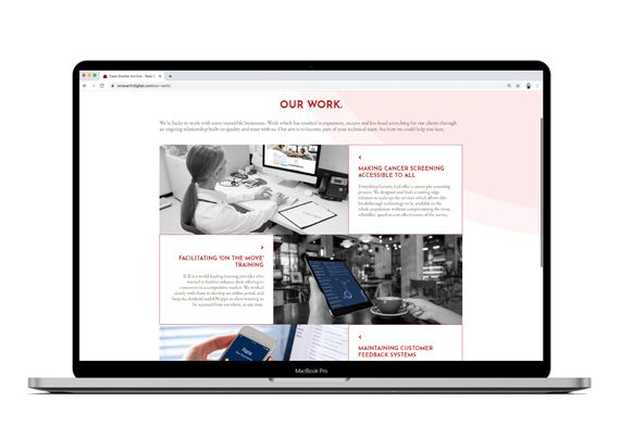
We started by having an in-depth meeting to tease out who their clients currently are, their prospective clients and who in those companies would be seeking their services. It also became apparent in the meeting we would need a solution which resolved how to show something which is not visual. Bringing their clients to the forefront and using them as case studies to highlight how software has improved their productivity in the workplace gave us a solid base for the structure, and look and feel of the site.
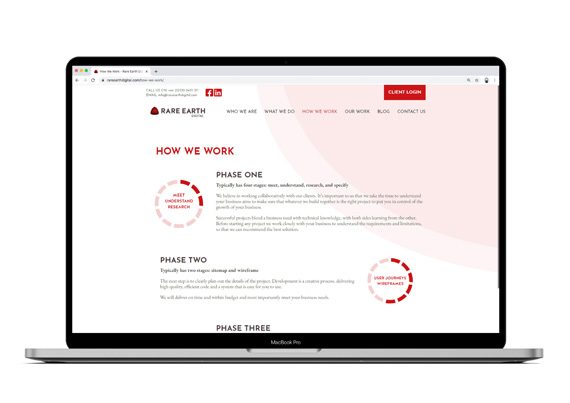
Wireframes were produced and presented to the team. We also wrote the copy for the site with a new tone of voice and approach. Once approved, these were turned into ‘design-flats’ for the developers at Rare Earth to build.


