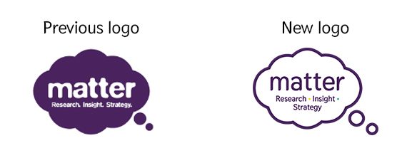
Matter Communications approached us with the creative challenge of giving their brand a refresh. Their current logo was dated, didn’t use a consistent colour palette and when reduced in size the strapline became hard to read and not very legible for users.
Our brief was to refresh the current logo to make it more appealing and legible to its audience, appropriate for its business and distinctive in its sector.
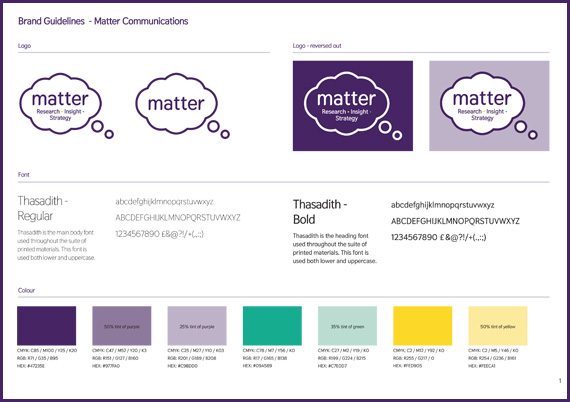
The refreshed logo still features the original bubble, but as an outlined shape as opposed to a solid shape which makes the shape appear softer and more pleasing on the eye. We subtly introduced two new colours to make it stronger, bolder and more legible. Introducing the green and yellow into the logo gives it an unexpected quirk people will notice and means we can use these colours in future design materials.
This project has given Matter a strong recognisable brand and more visual consistency in it’s approach.
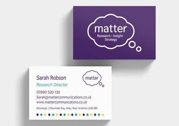
Since the rebrand we have gone on to produce business cards, letterhead, email footer, powerpoint template and a brand new website which launched mid September.
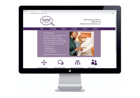
The new website has had a complete overhaul, not only bringing in the new look and feel but also extra functionality and much more detailed information for its users. Matter took advantage of our great value Website Package giving them a great fixed price for a unique website.


