Choose Your Future came to us requiring support in overhauling their new Nantwich central office.
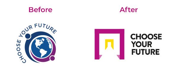
They had an existing logo that had been designed for their website, but we felt that it didn’t accurately represent their business. They agreed with us, and we set about re-branding.
The company provide opportunities for individuals to open new doors and make changes in their life. The logo we created represents this shift, showing forward movement and progression. The strong, bold shapes were key elements in the logo which could be used to make the new premises really represent their brand.
We carefully selected the colour palette to feature colours linked to success and luxury but which are also active, energetic and vibrant to communicate the journey people are about to embark on.
This was a great project to work on, despite the very tight timelines to work to and the clients were delighted with the result. Ian Murray from Choose Your Future said of the project:
“We are just delighted and it is all so motivational. Having the ideas is one thing, but the sheer quality of what JG Creative produced is very impressive indeed.”


