We were asked to create a new brand for ‘M Cubed’ – an IT recruitment company working in a specialist field.
The brand was targeting a niche audience – the areas of work are specialist, with candidates who are in very short supply; tech savvy and interested in new technology.
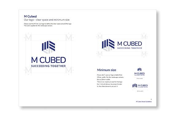
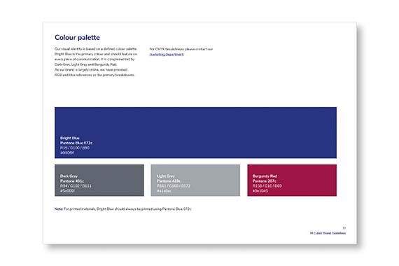
The concept takes inspiration from the name; the logomark is formed from by three lines creating each face of the cube, with the front two faces also forming an abstract ‘M’ and a ‘3’. The logo was combined with a strong colour palette and distinct imagery to use across their collateral, including the website, brochure and presentation templates.


