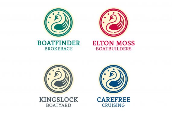
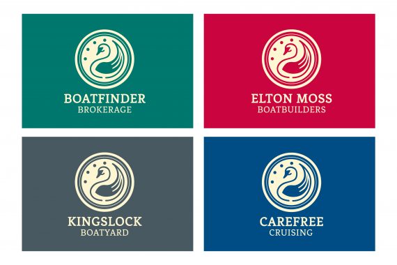
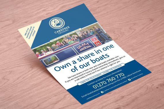
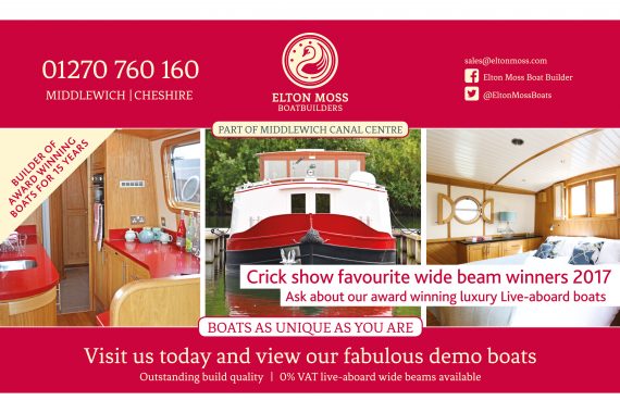
Middlewich Canal Centre came to us with the challenge of aligning their four different company’s logos to make them more recognisable as one organisation to encourage more cross-selling.
Taking inspiration from the swan that was integral on two of their existing logos, we researched canal boat painting pallets and styles and created a beautiful stylised swan to work throughout. The individual companies colours came from an authentic pallet which creates a simple and effective brand.
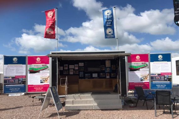
Each year, they take a stand at Crick Boat Show so we used this new brand to produce the artwork for flags and boards as well as a suite of leaflets.
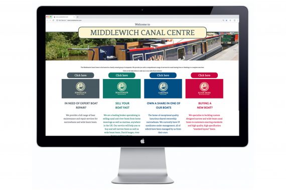
We also created the artwork for their trailer and their website which users could use to navigate to the individual companies.
This project has given Middlewich Canal Centre a recognisable brand and given the organisation more consistency in their approach.
Owner Ruth said of the project “I would just like to thank you and your team for the fabulous work you have done on our rebrand. From beginning to end you were efficient, listened carefully and worked with us to produce some excellent results that we are really proud of and are helping move our companies forward”

