The current and ongoing pandemic has seen many companies and services reconsider their brand, for a multitude of reasons. Many are diversifying in order to keep their business running, whilst others are scaling services up to meet a change in demand.
SWaNS approached us in the latter part of 2020 – they were experiencing an astronomical surge in demand for mental health services and an obvious shift in the type of person seeking them out. They needed a change.
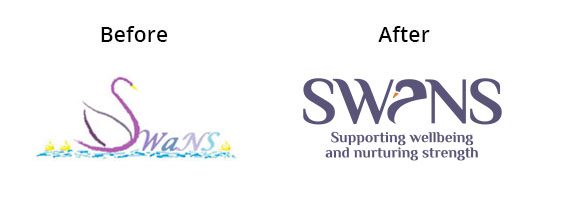
The new logo keeps the essence of the previous one, but is cleaner and has a neutral feel designed to appeal to all.
The swan icon, incorporated via the ‘a’ in the acronym happily sits in the centre giving it a much more ‘together’ feel, making it fit for purpose, and also providing a clear and distinct icon to their brand which they can use going forward.
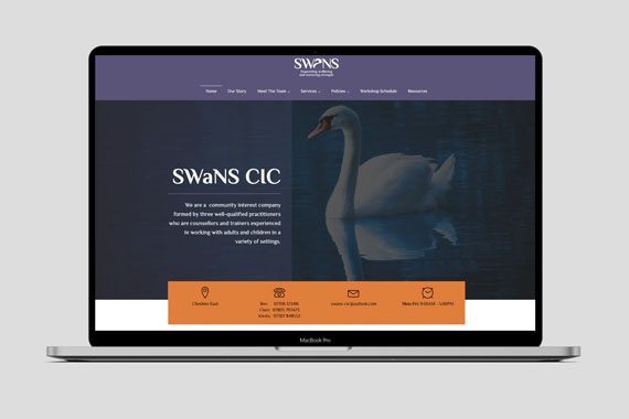
They were able to apply the new brand to their existing website and are delighted with the result.
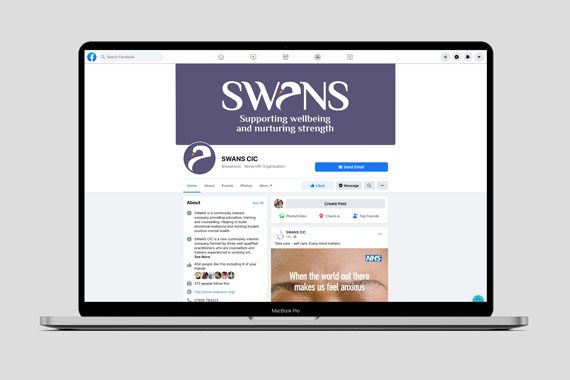
Alongside the re-brand, we have started managing their Social Media accounts, to increase awareness and enable more people to find their services. In the first month, page likes increased by 700%, post reach by 98% and engagement by 246%.
Bev Daniel, SWaNS Director and Counsellor said of working with us:
‘When we first met the team at JG Creative we felt that they understood who SWaNS were straight away and when we saw their ideas we knew that they had captured just what we needed to refresh our brand as we approach our 5 year anniversary.
We have enjoyed working with all the team at JG Creative, they took us through every step of the process both professionally and in tune with our needs. We love our new logo and the colour pallet chosen for our website and marketing materials and feel the essence of SWaNS has been captured perfectly.”


